


Biotus — comprehensive brand design support
Biotus is a major Ukrainian retailer of vitamins and dietary supplements, with an extensive network of physical stores and an active online business.
I've been working with Biotus for over 9 years — during that time I've contributed to the brand's development at every key level: from digital products to offline communications and packaging design.
UX/UI
E-commerce platform redesign
The main goal was to turn a complex, multi-page resource into an intuitive shopping tool while keeping a high level of informativeness.
The new site design was built with a focus on making browsing and buying easier:
reworked navigation and catalog structure
improved filtering and the checkout flow
visually optimized product cards for quick scanning and comparison
Homepage
1
Switching from single banners to a grid layout increased promo visibility by 40%.
2
Added quick links to popular and commercially important sections.
3
Introduced a "by need" carousel that helps users look for a solution to a specific problem, not just a specific product.
Further down the page: a popular brands carousel, seasonal recommendation blocks, a curated selection of popular products, and a blog section with filtering by topic
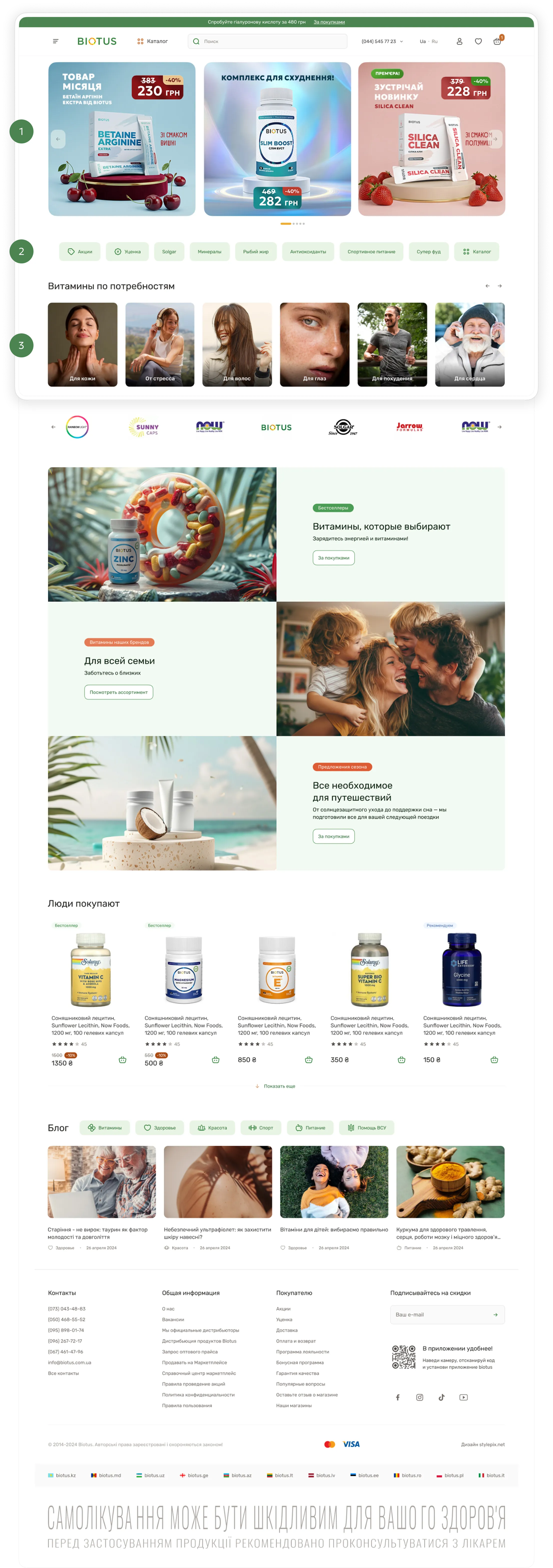
Effect: the homepage became a navigation tool rather than just a showcase — users find relevant products faster and go to the catalog more often.
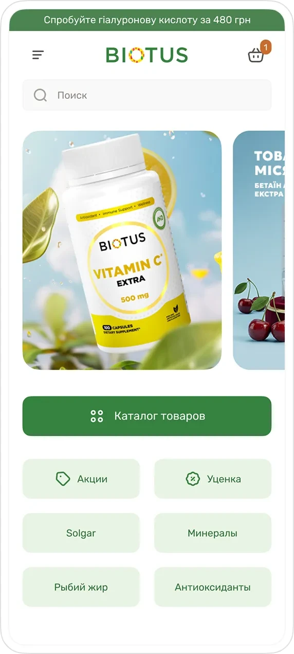
The incomplete-swipe principle
Part of the second banner is visible in the mobile view, prompting users to keep exploring the offers.
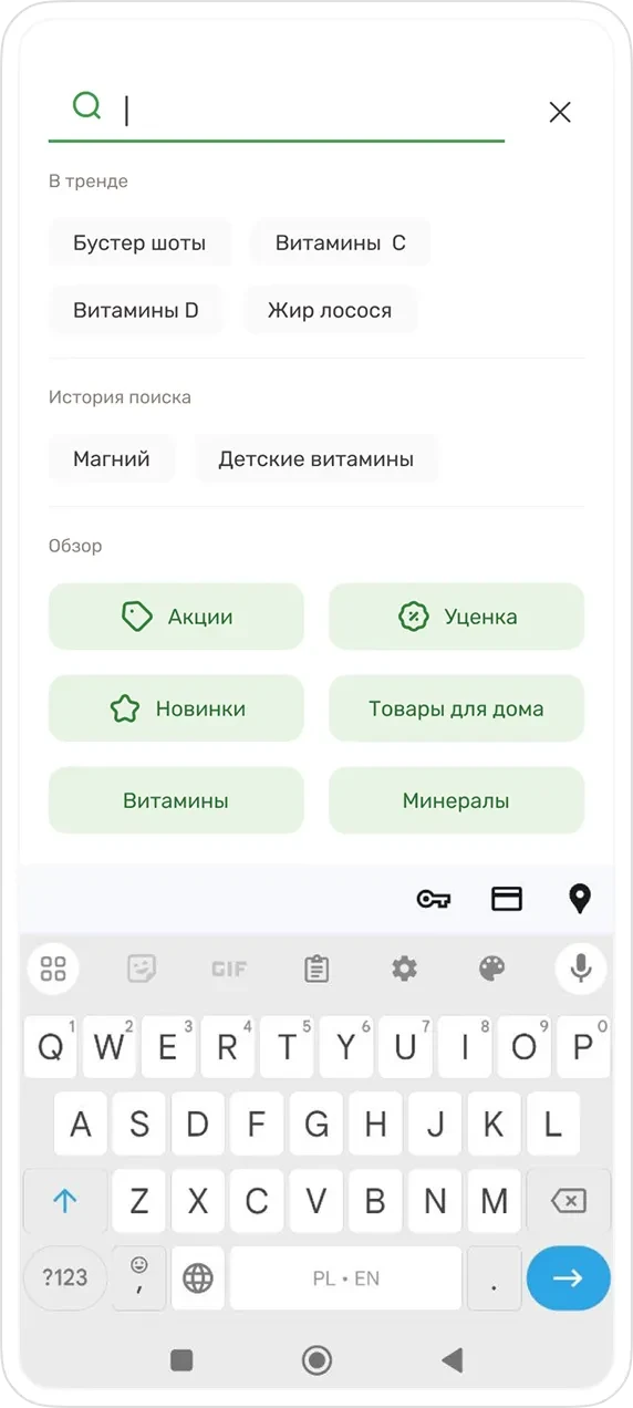
Search and the no-query scenario
Search was treated not just as an input field, but as a separate product scenario.
Before typing a query, users are shown trending categories and commercially important sections, which speeds up their choice and reduces frustration.
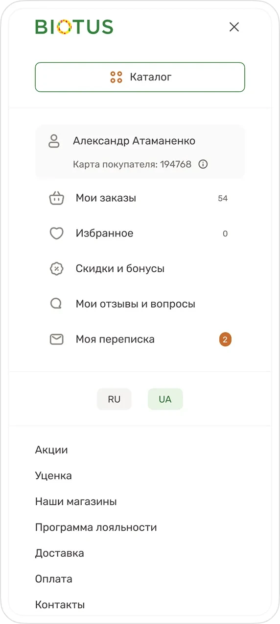
Menu
The site menu provides quick access to the catalog, login and personal account, as well as service sections and helper features.
Product list
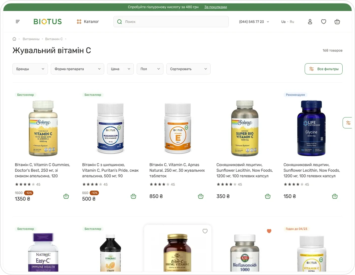
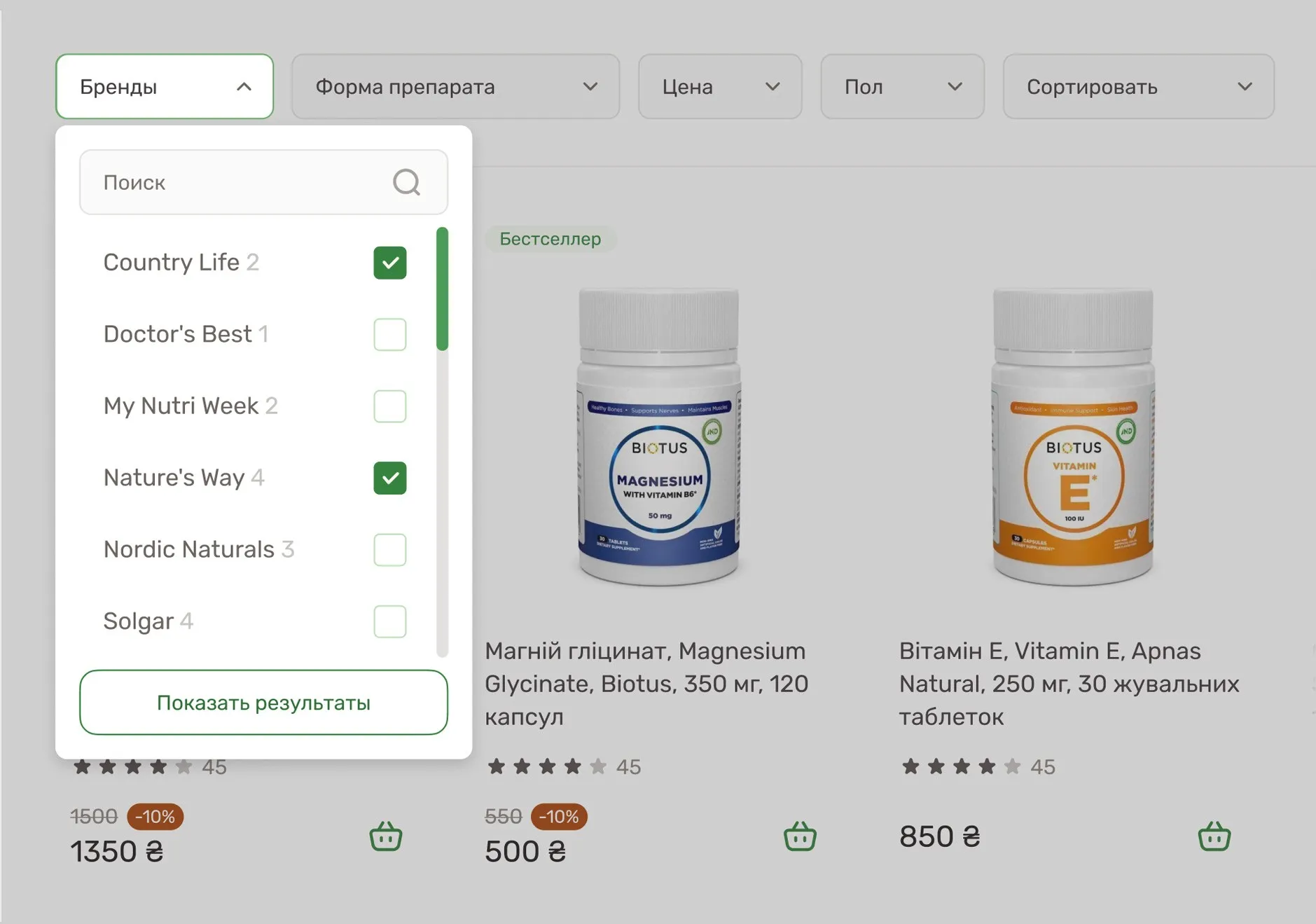
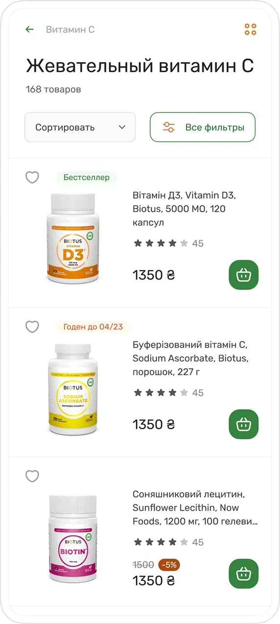
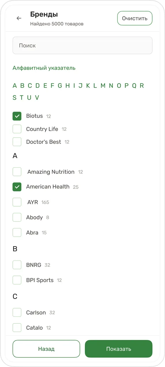
Smart Filtering: moving frequently used parameters into a horizontal stack freed up space for an extra column of products, while secondary filters are tucked into a side panel to avoid overwhelming the user during selection.
Product tile
In the catalog, the main task is to preserve a sense of lightness in the interface even with a large number of products.
To achieve this: interactive actions — the "Buy" and "Add to favorites" icons are moved to the hover state.
In its resting state the card stays neutral, and on interaction it clearly hints at the next step.
Product page
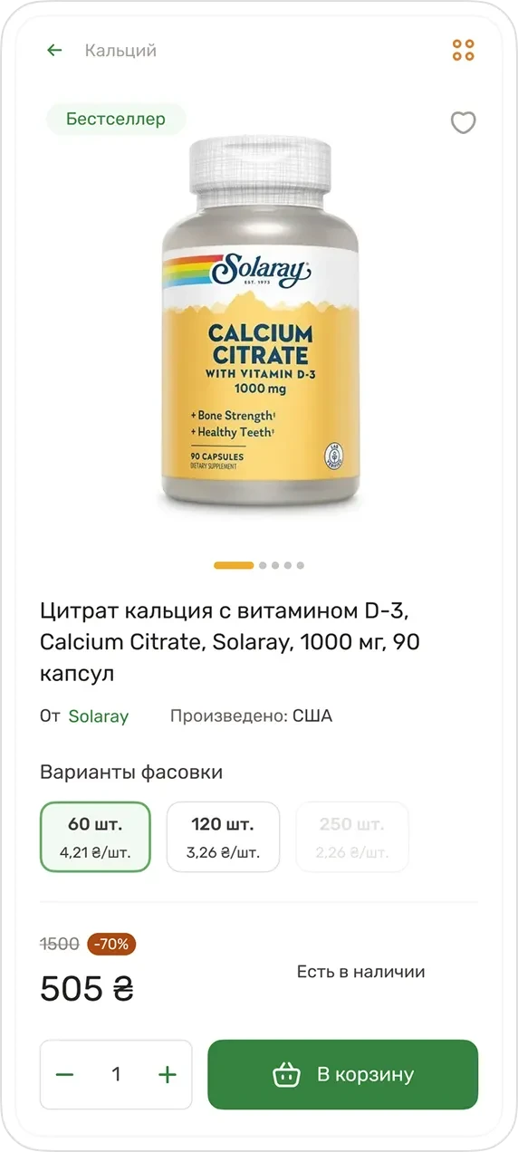
The product page is designed as the key decision point for purchase. The main task is to remove the user's doubts and lead them to add the item to the cart.
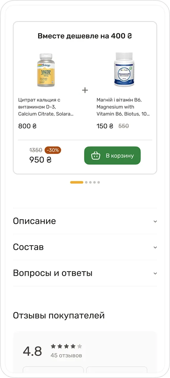
Combo offers
Increase the store's average order value
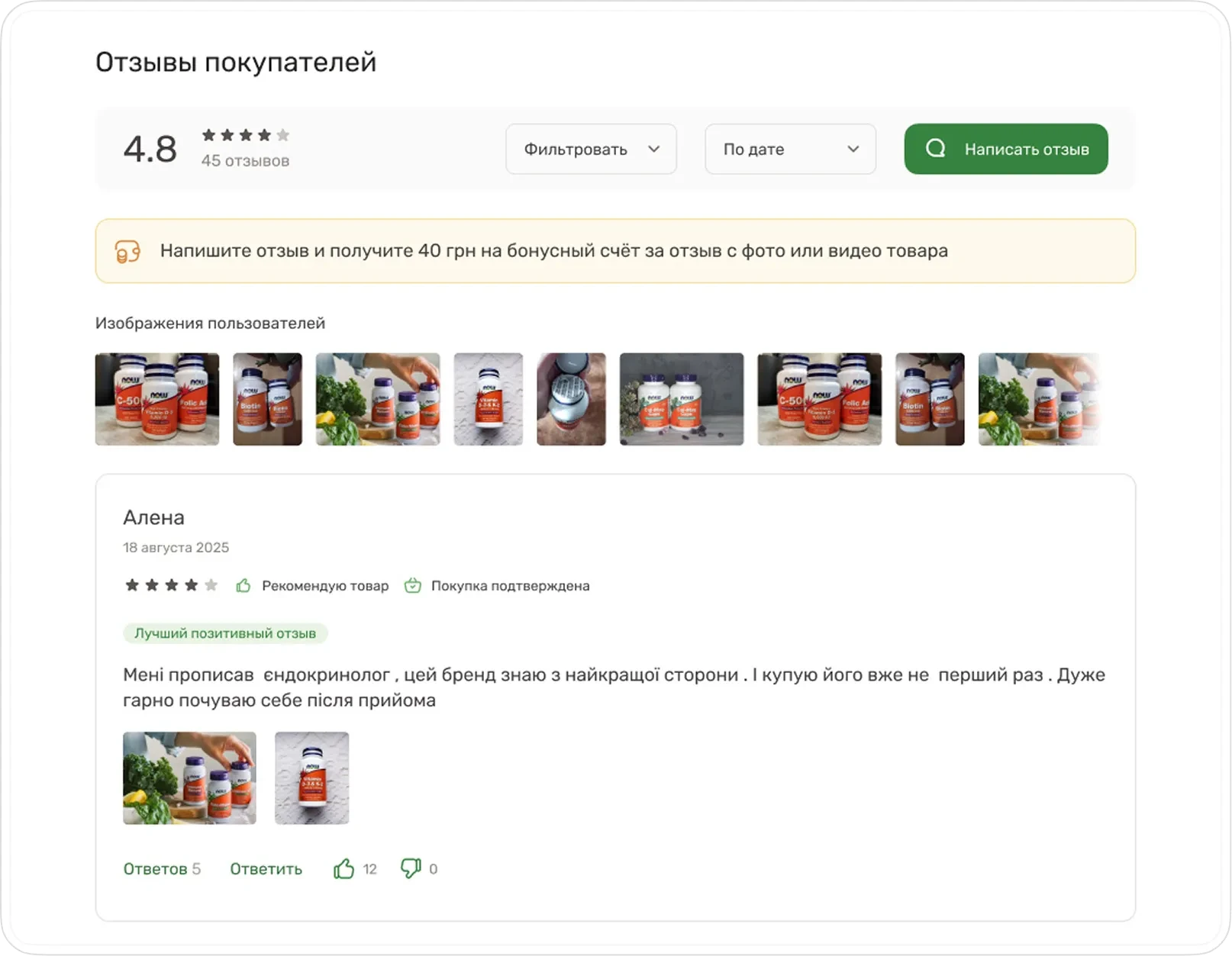
Social proof and trust
Reviews are given their own full-fledged section:
overall rating is displayed
filtering and sorting are available
reviews with photos build trust
there's an incentive to leave a review (bonus points)
Other site sections
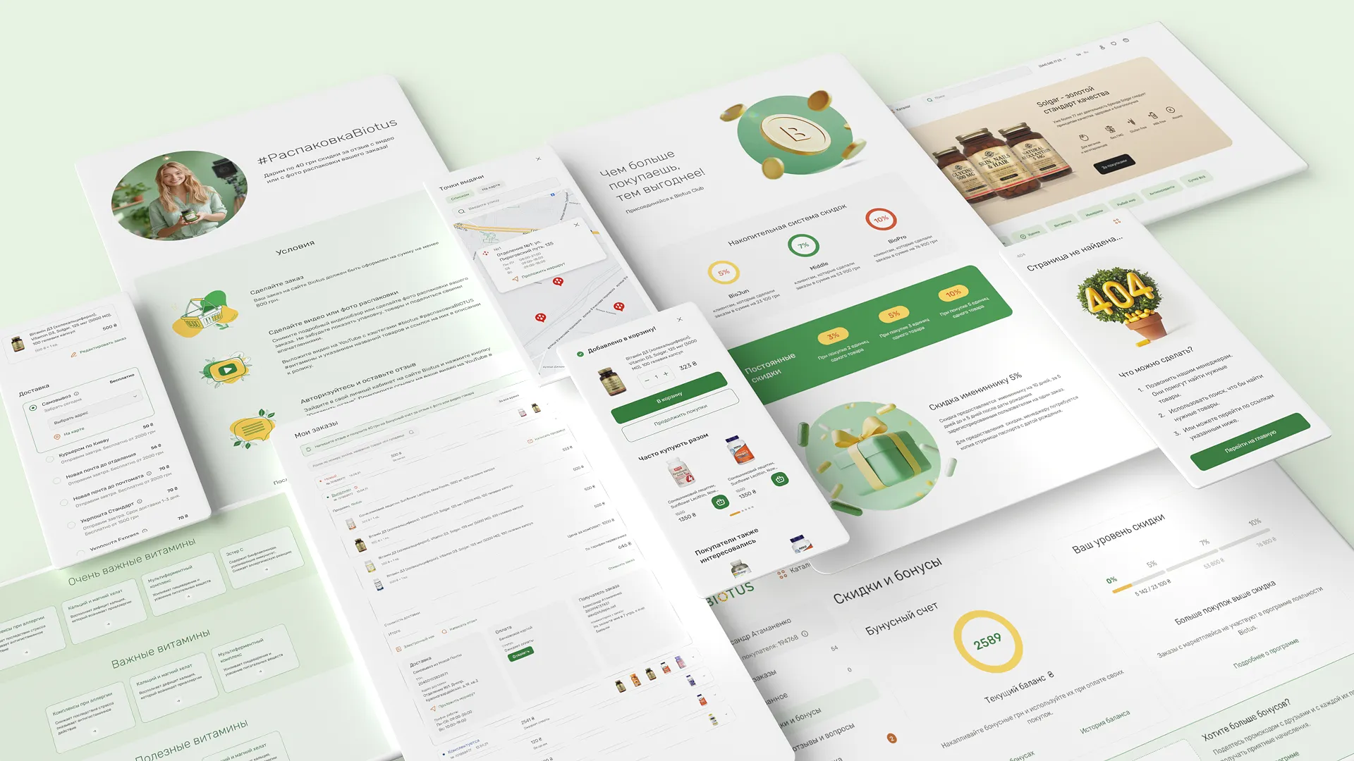
All key pages and service scenarios were also worked out separately:
promo pages for the bonus program
nutritionist consultation service
a directory of conditions with vitamin recommendations
a large educational and reference section
a personal account where users can:
track orders
participate in the bonus program
manage their reviews
edit personal details
As a result, the site became functional and visually light, without excess graphics, and focused on user tasks.
A B2B product for wholesale clients
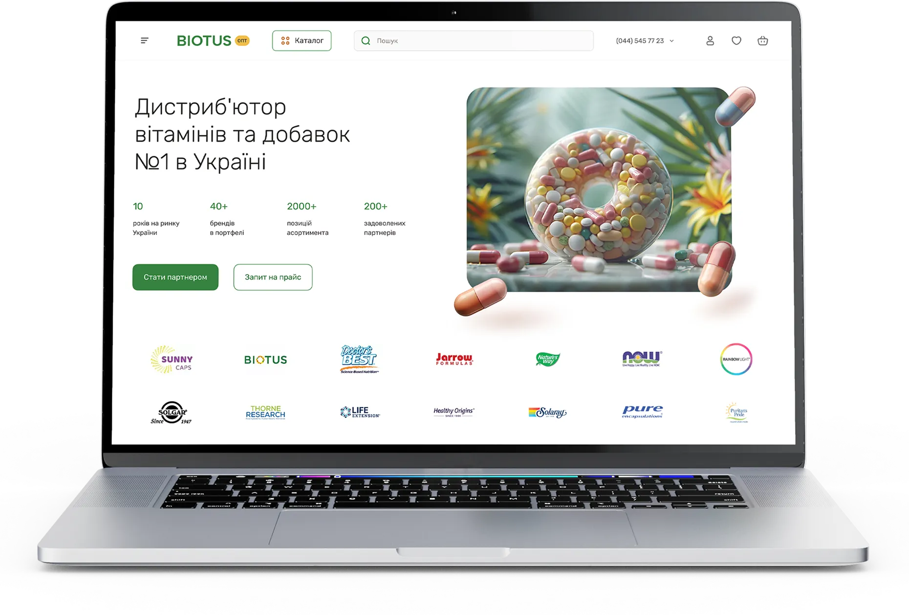
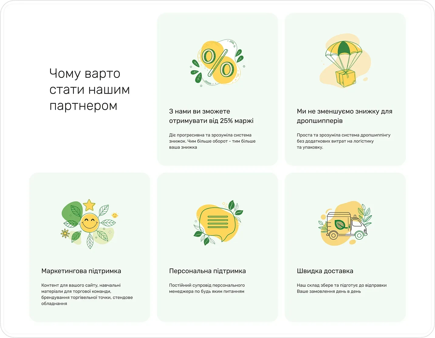
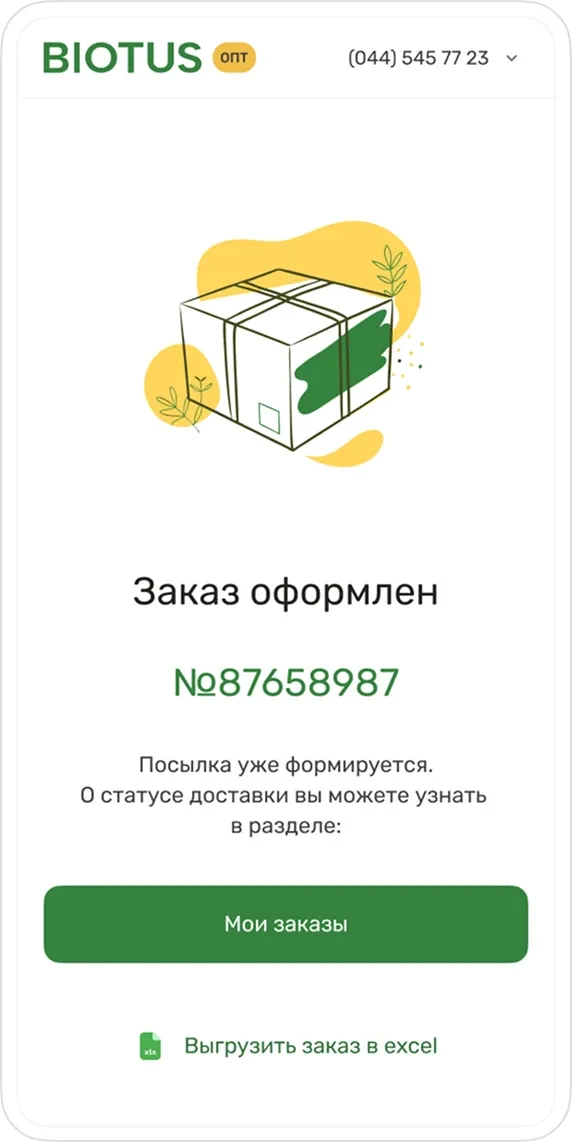
A separate site for the wholesale audience is designed as a working tool, not a marketing showcase.
The focus shifted to speed and functionality:
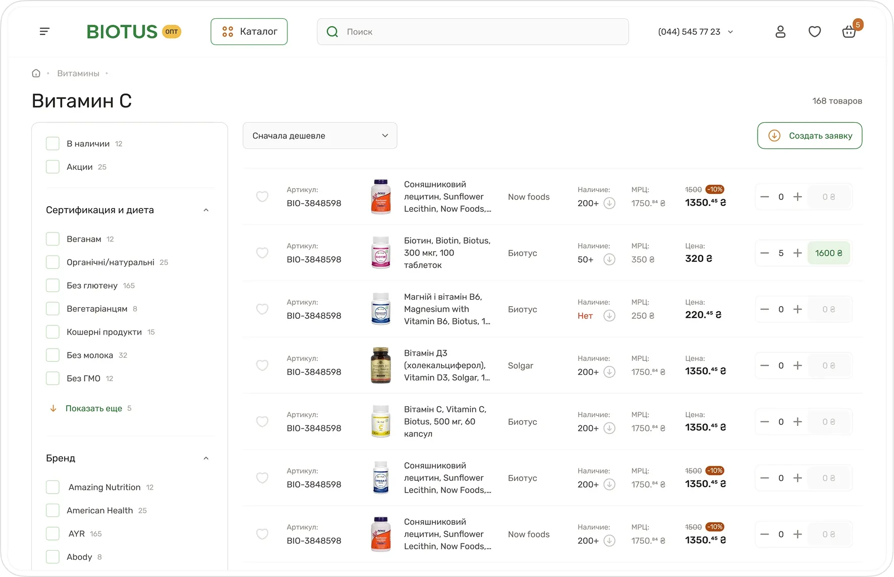
the catalog is optimized for quickly filling the cart
quantity fields added directly in the product list
products added to the cart are highlighted with color
individual and recommended retail prices are displayed
reworked the personal account with a loyalty program

Graphic design
and brand support
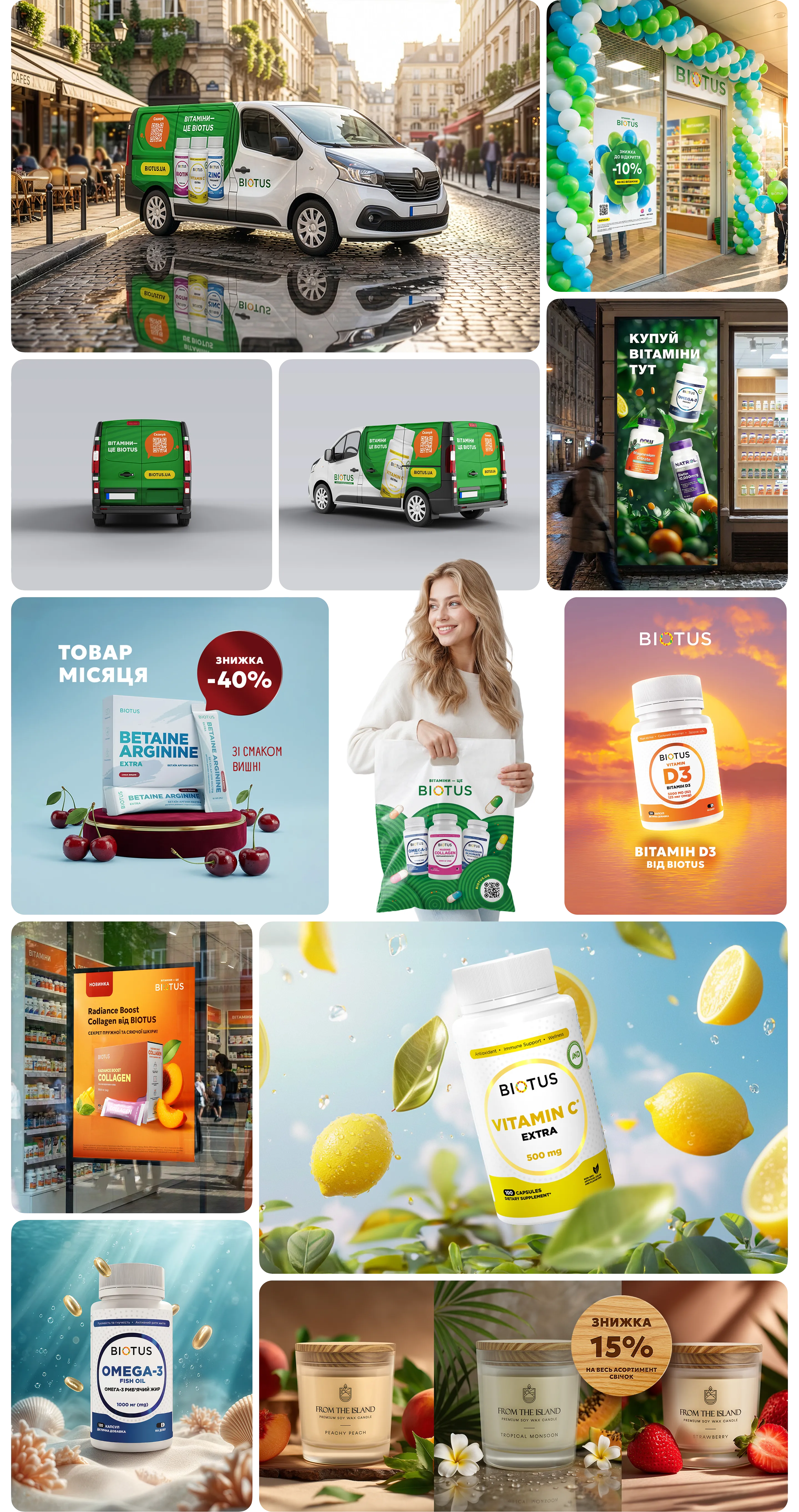
Monthly brand support includes creating a wide range of promo materials:
banners for the site and ad networks
print materials: posters, flyers, shelf wobblers
design for physical points of sale (signage, wayfinding)
and much more.
BIOTUS packaging line design
The project involved creating a unified visual system for a product line with varying purposes and formulas. The design emphasizes cleanliness, readability, and visual hierarchy, making it easier to navigate the line and highlighting the functional differences between products.
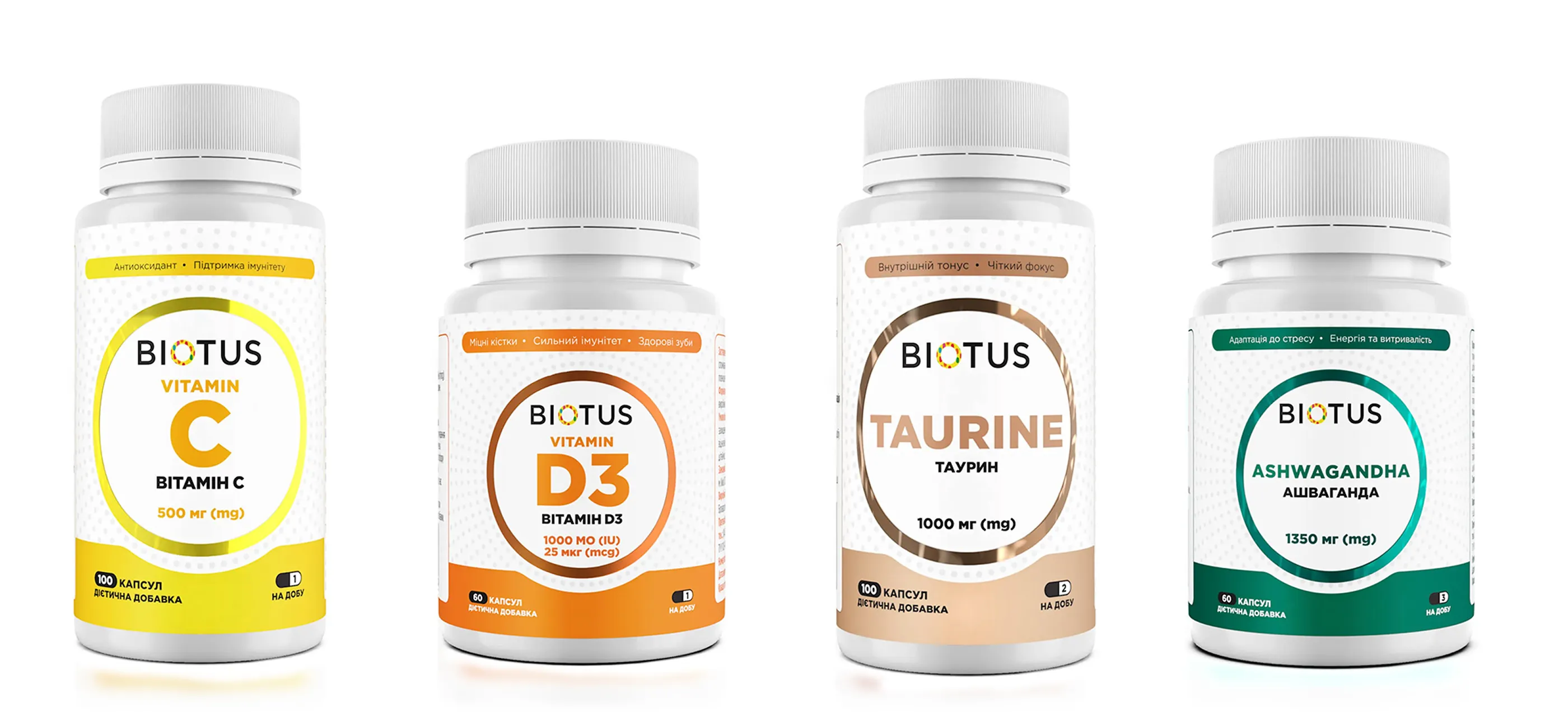
Graphic element
The central element, a concentric circles shape, symbolizes a focus on health and the product's systemic effect on the body.
Color coding
Each product category received its own bright color accent, making it easier to find on the shelf.
Adaptability
An adaptive label layout for different container formats — from narrow bottles to wide jars.
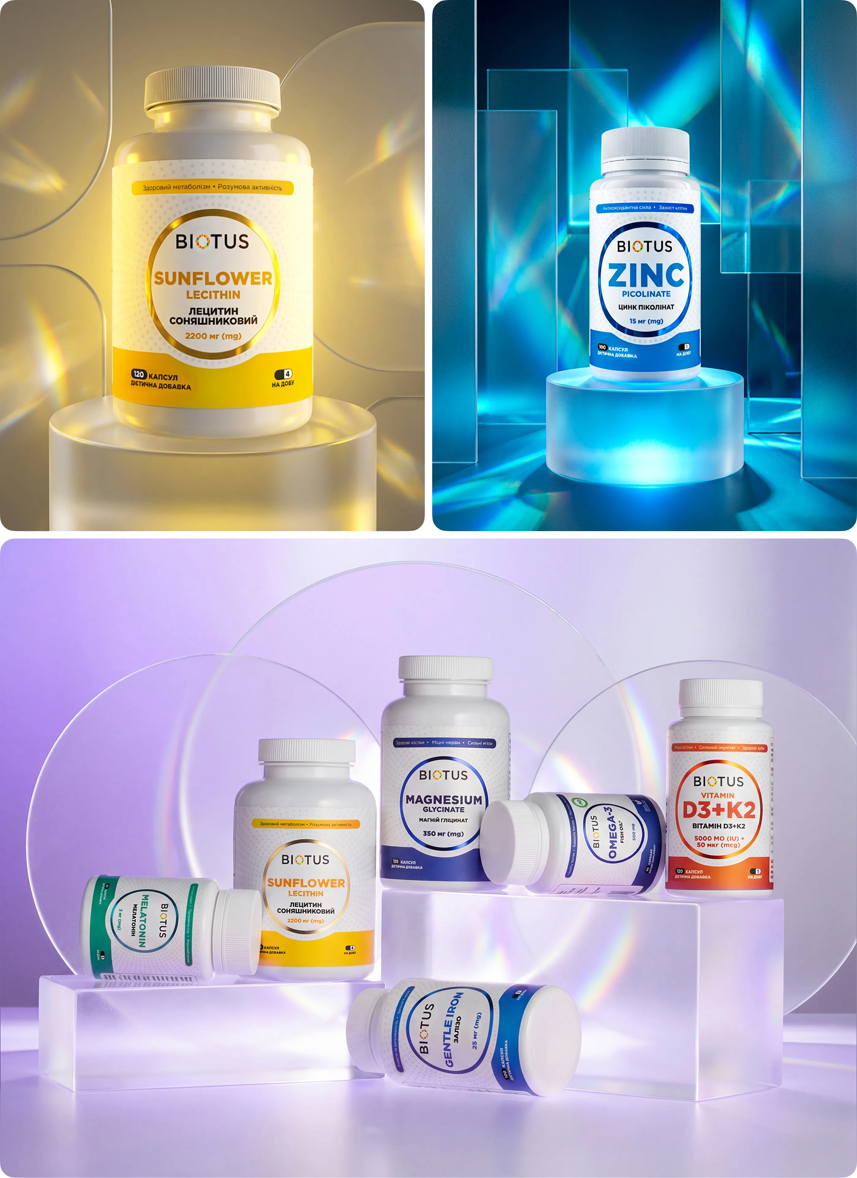
Results of the collaboration
Years of collaboration with Biotus made it possible to build a cohesive brand design ecosystem — from e-commerce and the B2B platform to packaging and graphic support:
the site redesign increased promo visibility by 40% and made the catalog convenient for quickly choosing among hundreds of products
a dedicated B2B product gave wholesale clients a fast, functional ordering tool
a unified packaging system and ongoing graphic support keep the brand visually consistent across every touchpoint
This collaboration is an example of how design evolves alongside a business over the years, rather than remaining a one-off project.

РОЗКАЖІТЬ ПРО ПРОЄКТ
Опишіть коротко задачу — відповім протягом дня, обговоримо терміни та формат роботи
Відправляючи запит, ви погоджуєтесь з Політикою конфіденційності

