Online store
of computer equipment


My collaboration with PC Market began in 2012 — I developed the company's brand identity and redesigned the online store. The brand's main audience is young gamers, so the styling turned out bright and youthful, to speak their language.
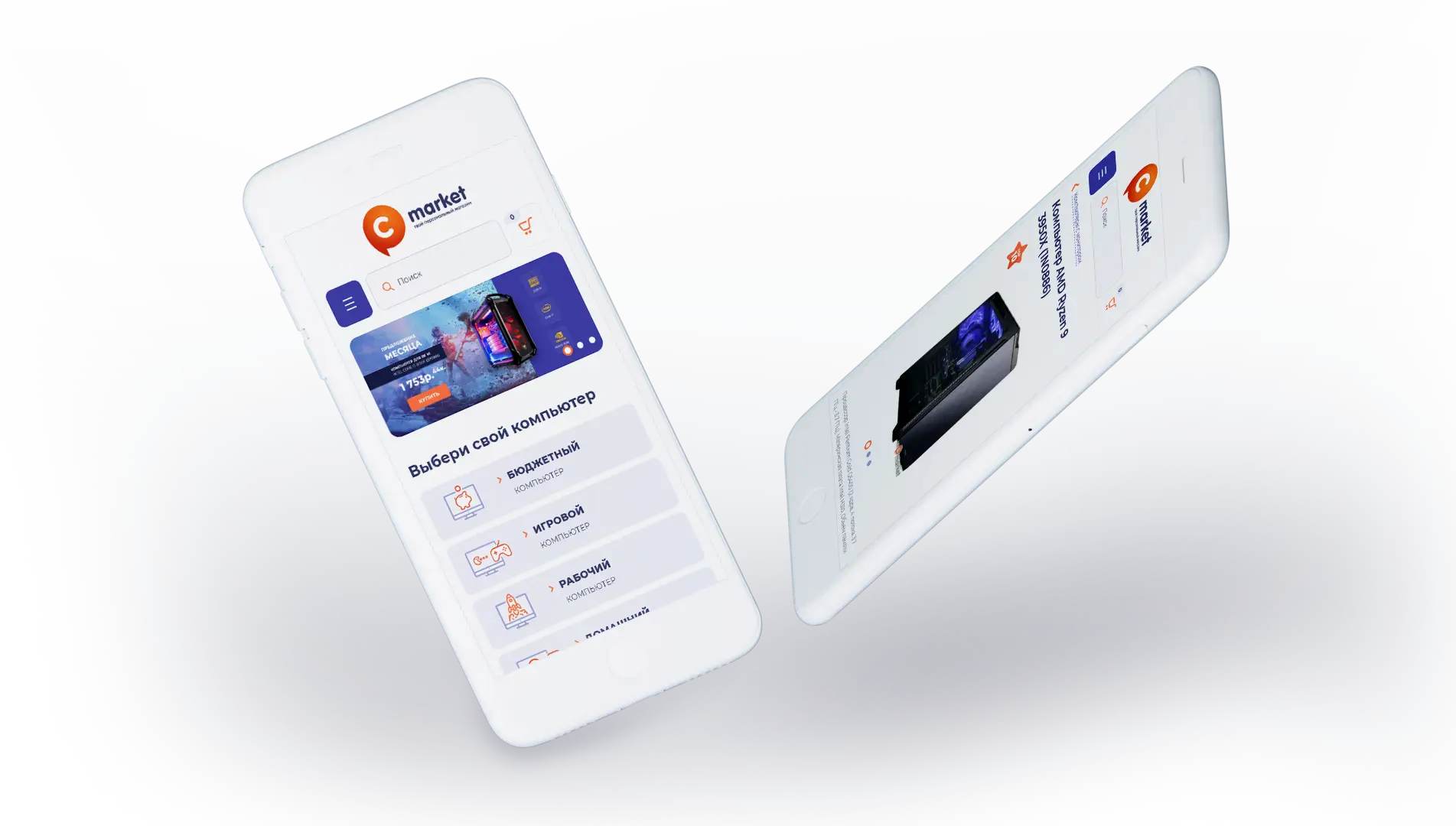
At the same time, the needs of an older generation choosing a computer for home, office, or serious tasks were taken into account. By 2020, the company had shifted more focus toward PC assembly and modifying existing models — this became the reason for the site redesign, which also had to become fully responsive for mobile devices.
Logo and brand identity
In the logo concept, I turned the letters P and C (from “personal computer”) into a playful speech bubble. This unusual move symbolizes not only the brand's aspiration to be a personal assistant, but also immediately creates an atmosphere of friendliness and readiness to help with choosing a computer.
The tagline “your personal assistant, your personal store” emphasizes the brand's desire to be not just a seller, but a true companion in the world of technology.

New website design
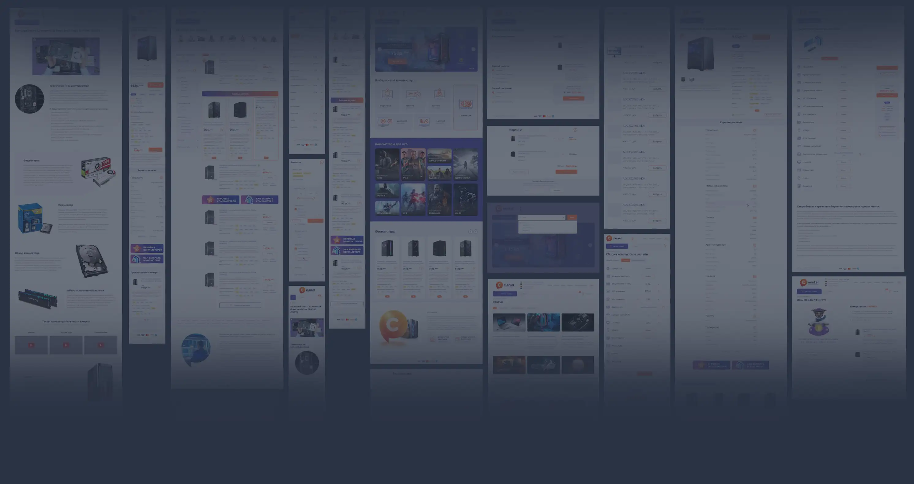
The new design became more streamlined and simpler, with a number of functional improvements that directly impacted conversion.
The homepage offers several entry points for different types of users. Promo banners below the header grab attention, and below that — computer selection for specific needs, from a budget home option to gaming or graphics workstations. A separate category is dedicated to the PC builder, where users can assemble a computer themselves.
A gamer's heart
The “Computers for gaming” block is highlighted as a separate entry point — for users who want to play specific games but don't want to figure out component specifications.
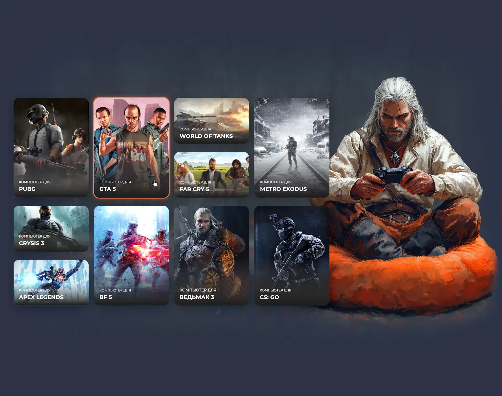
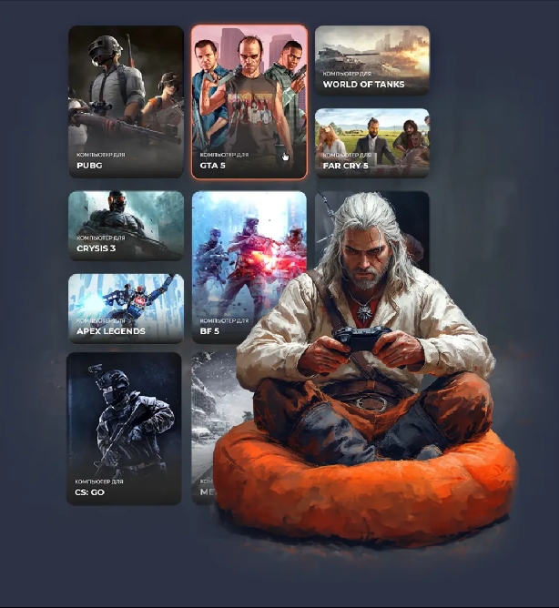
Users simply select the games they plan to play, and the system automatically suggests suitable computer models.
Catalog
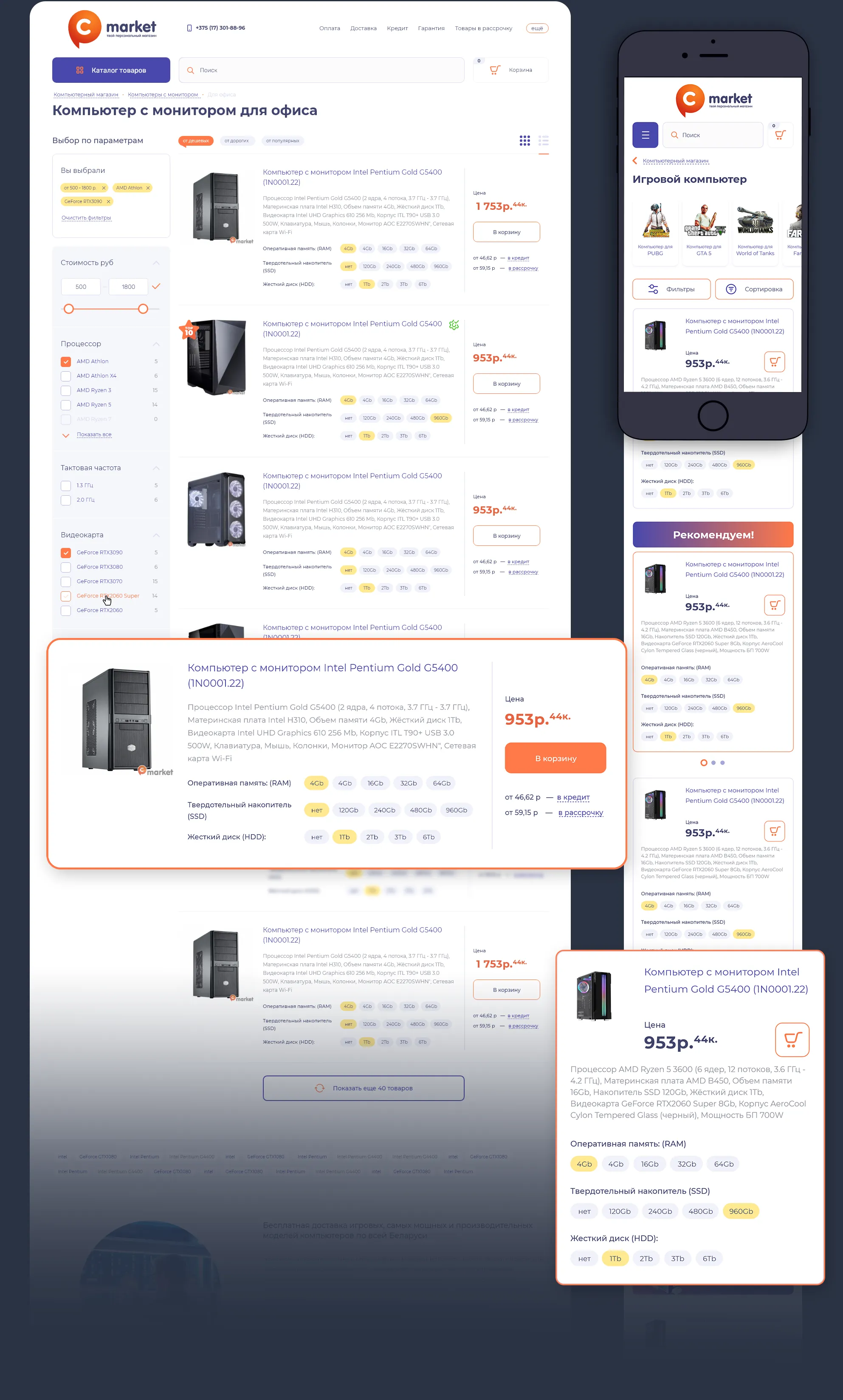
The catalog got a configurator right in each PC model's card — users can change the configuration and instantly see how it affects the price without going to the product page. Simple cards, not overloaded with information, increased browsing depth and boosted purchase conversion.
Product page
The product page got a configurator where users can change components and add peripherals. The monthly installment payment amount is shown separately — an important decision factor for customers planning to buy that way.
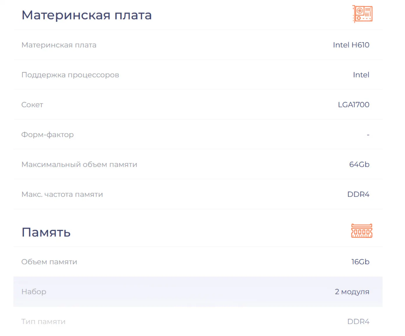
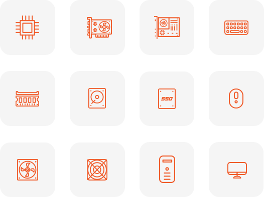
The computer's specifications are split into modules for maximum informativeness, with each module illustrated with icons for easier perception.
Build it yourself
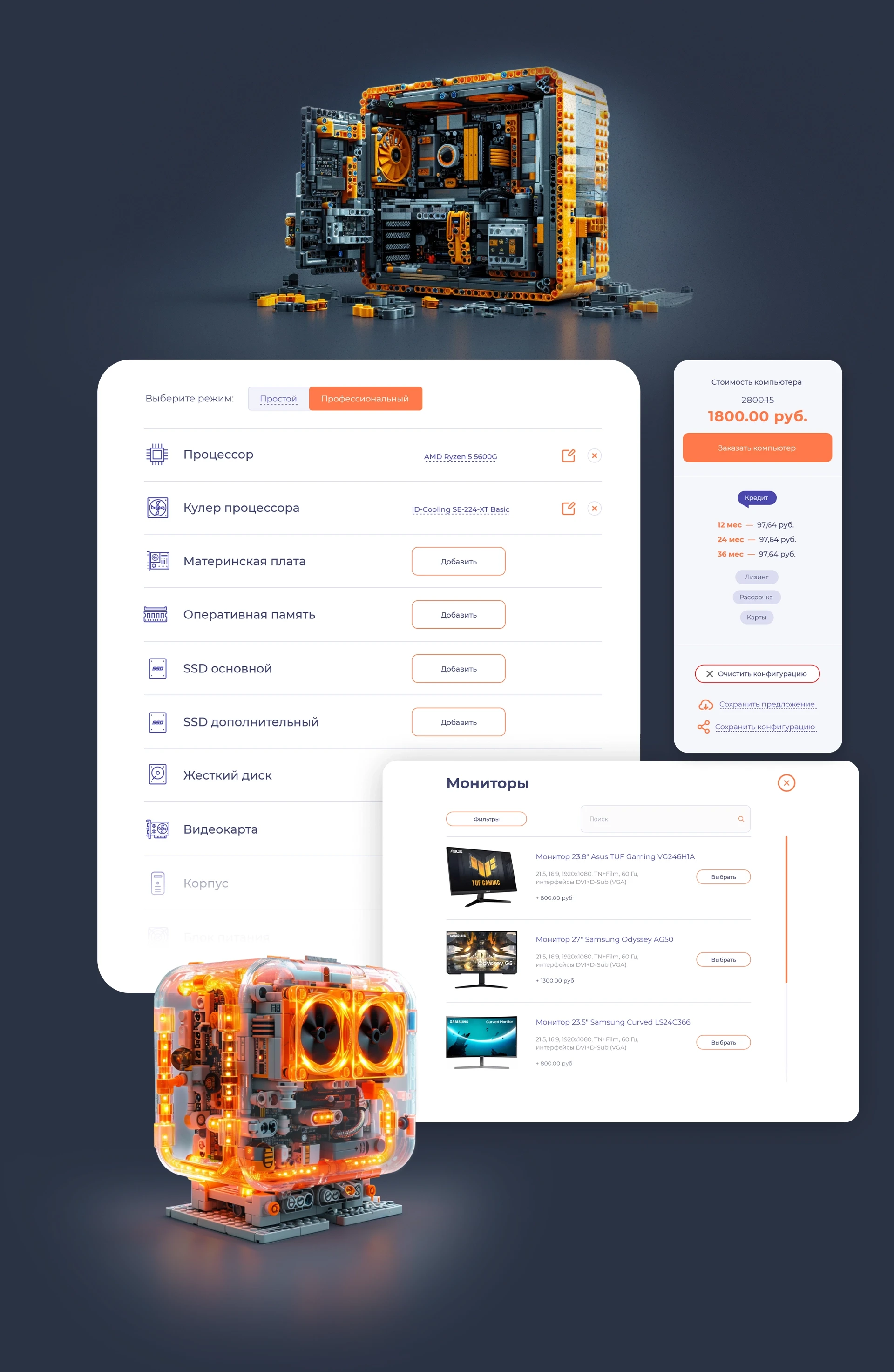
In addition to ready-made models, the site lets users assemble an individual PC through the builder.
The builder offers two modes — for inexperienced users and for professionals. For example, after selecting a processor, the system automatically shows only compatible components, and users immediately see the total cost of the build.
Visual communication
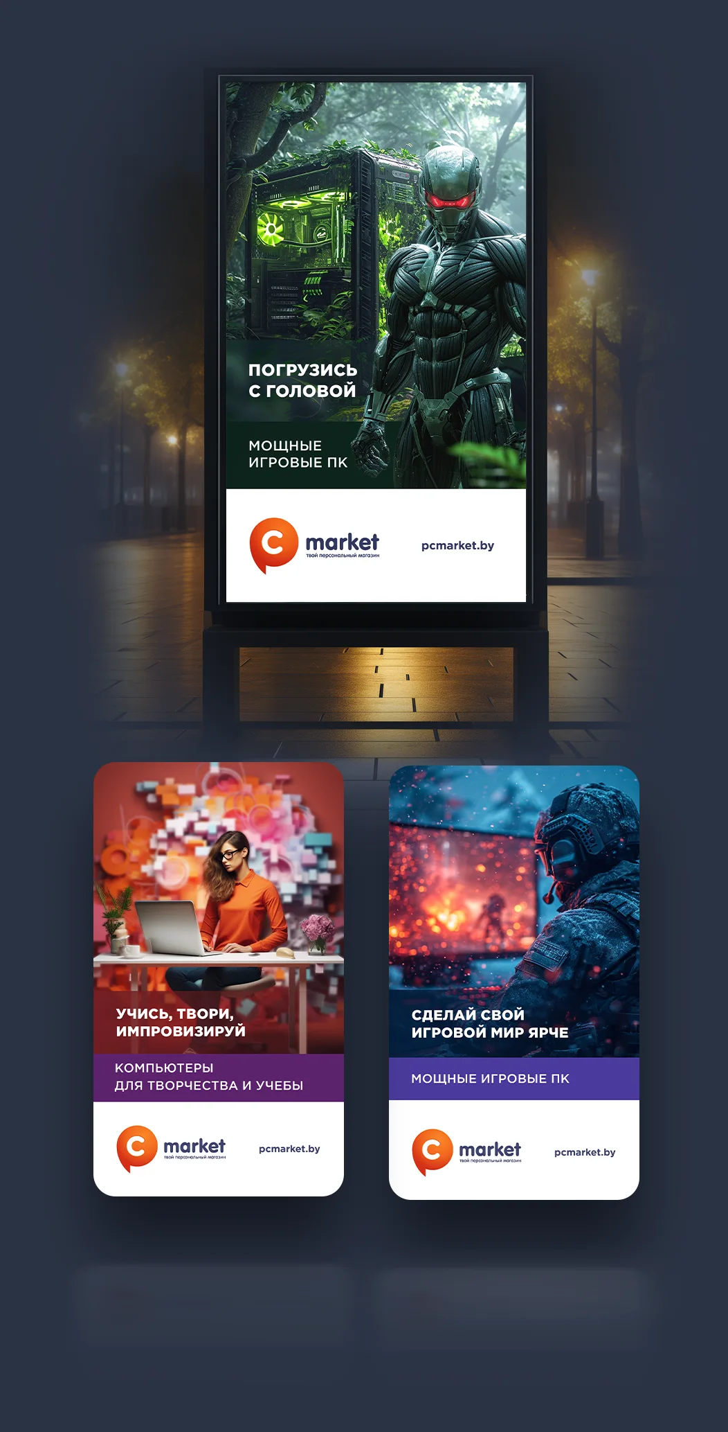
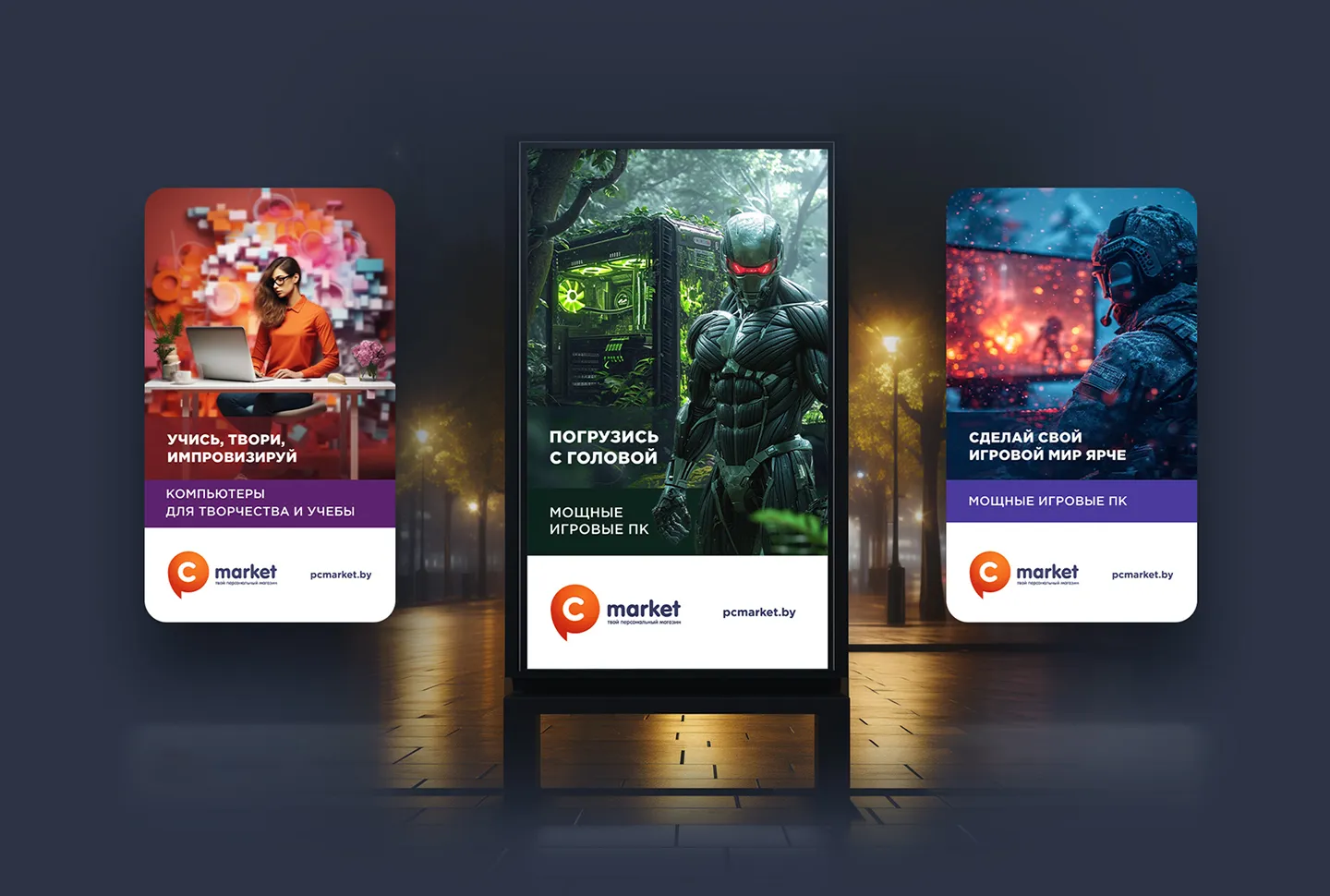
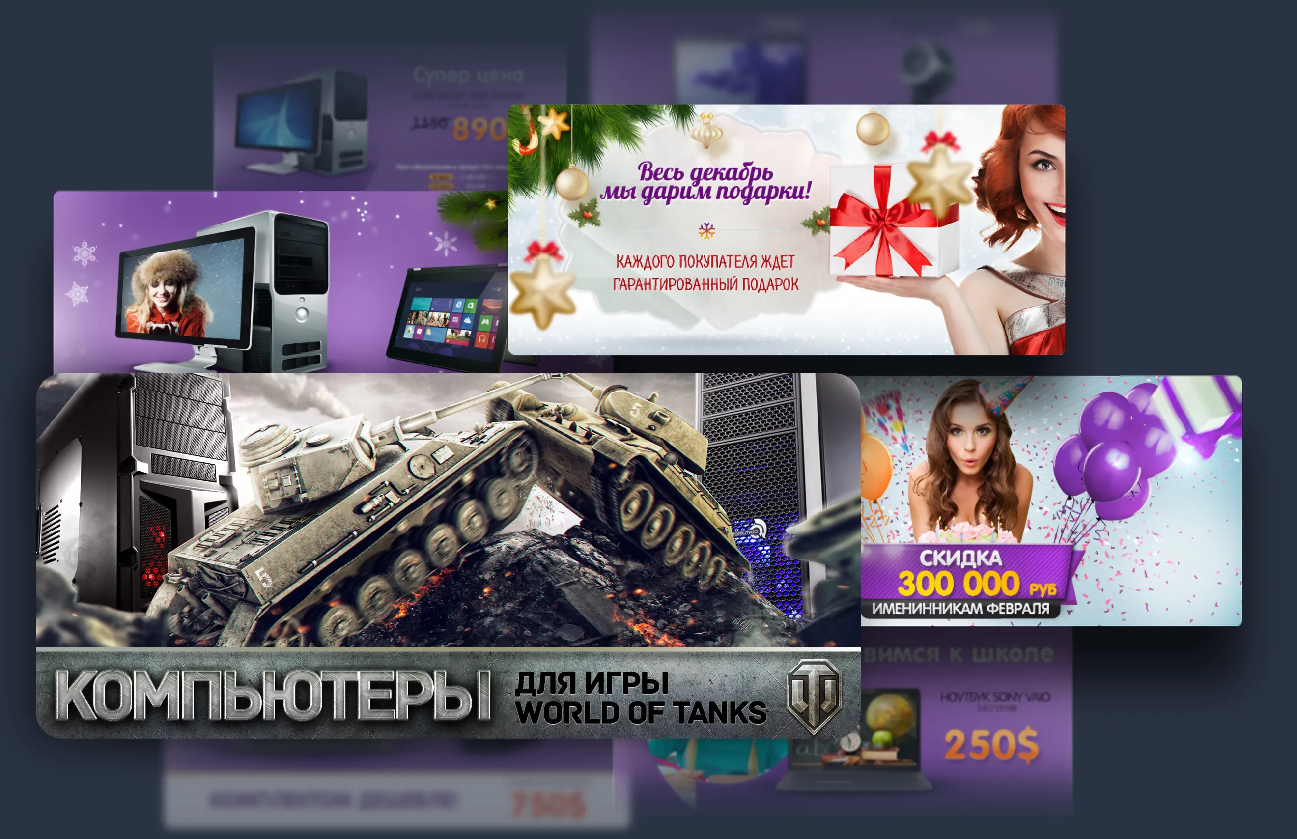
As part of the project, I was also responsible for the brand's graphic support: advertising banners for outdoor and online campaigns, as well as seasonal site decoration for holidays.

Result
Increased user reach: the site became responsive, increasing its accessibility for mobile device users.
A significant conversion increase: the number of orders on the site grew by 20%.
Increased browsing depth: users started spending more time on the site, studying information about products and services.
A higher average order value: users started buying more expensive products and services.
The new design made the site more convenient and understandable for users. The checkout pages were separately refined to make placing an order simpler and faster.
Attention was also given to the company's blog, where original tests and equipment reviews are published — this increases user trust in the brand and its products.