


Startec Holding
Startec Holding is a leading player in the manufacturing, supply, and service of high-tech metalworking and power equipment.
The task
Create a cohesive visual identity that emphasizes the company's technological leadership.
The project involved developing the main brand, the STH sub-brand for the European market, corporate workwear design, a multi-module catalog, and two complex web solutions.

Visual concept and logo

I built the solution on the aesthetics of machine engineering and precision.
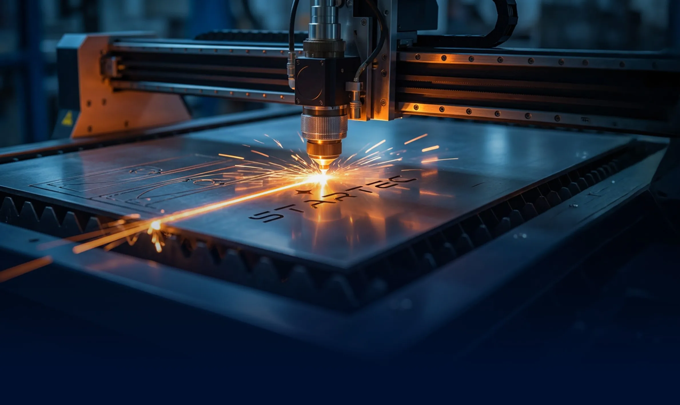
A custom geometric sans-serif with distinctive 'cuts' mimics laser-cutting lines and machine tool components. The open letterforms symbolize innovation and transparency in business processes.
The four-pointed star (spark) represents the point of contact between the tool and the metal. It serves as a visual accent and a 'guiding star' pointing to the holding's leadership.
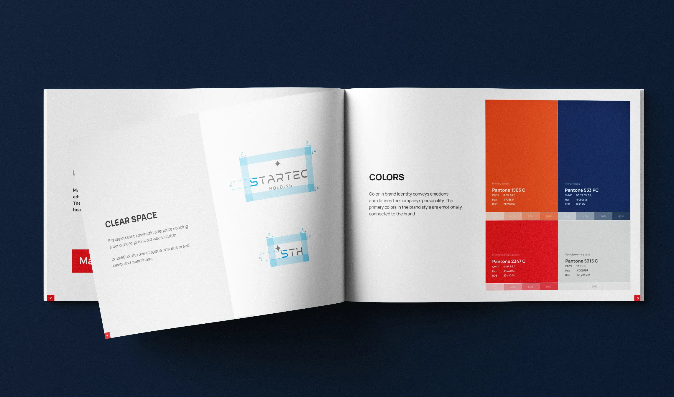
A deep 'industrial blue' (reliability, expertise) contrasted with a 'glowing orange' (manufacturing energy, dynamism).
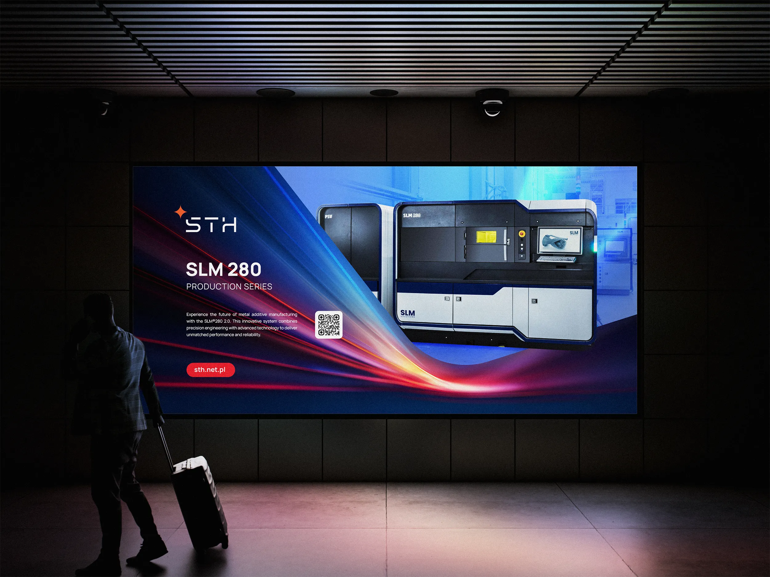
STH sub-brand: A streamlined version of the logo was developed for entering the Polish market. The STH abbreviation preserves the typeface family's lineage.


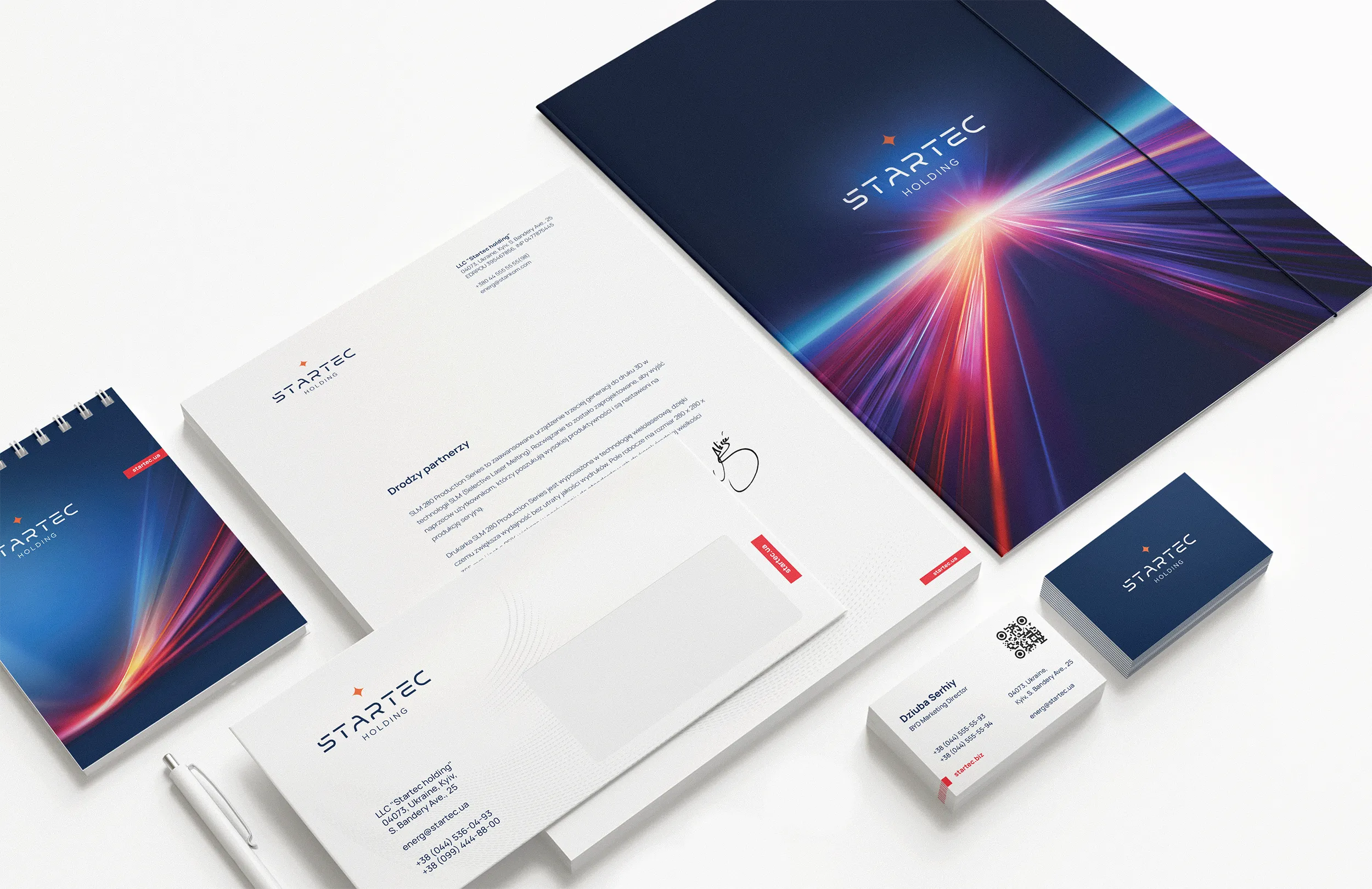

Corporate identity
and workwear
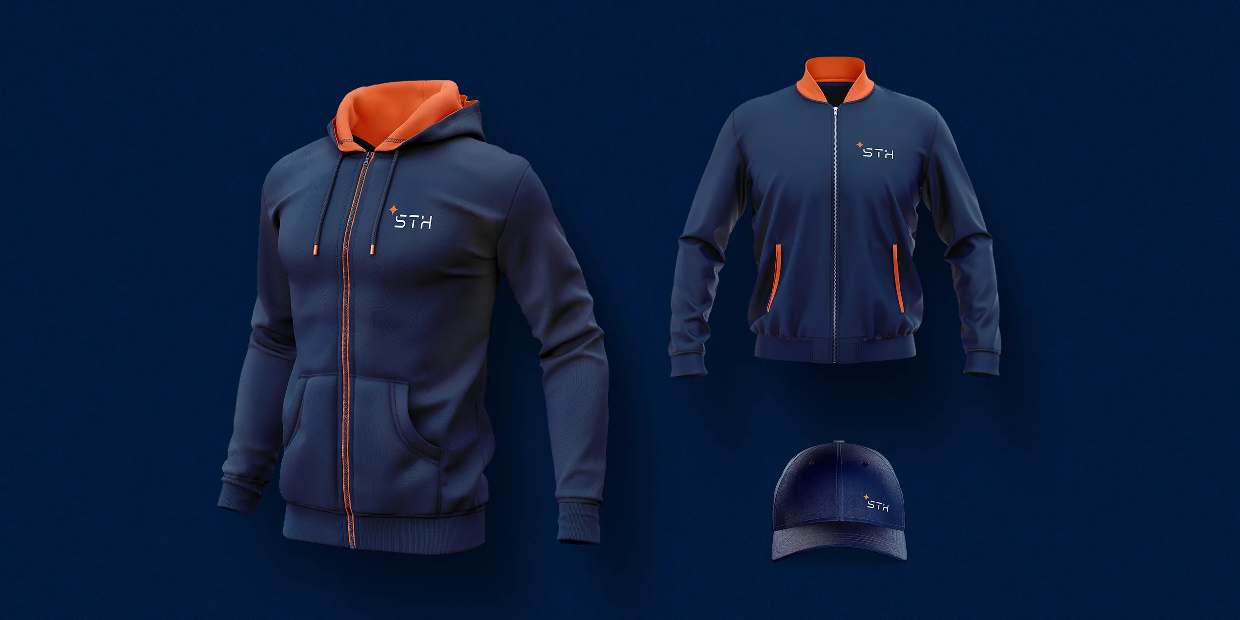
I developed a workwear line that turns ordinary 'protective clothing' into a technological lifestyle.
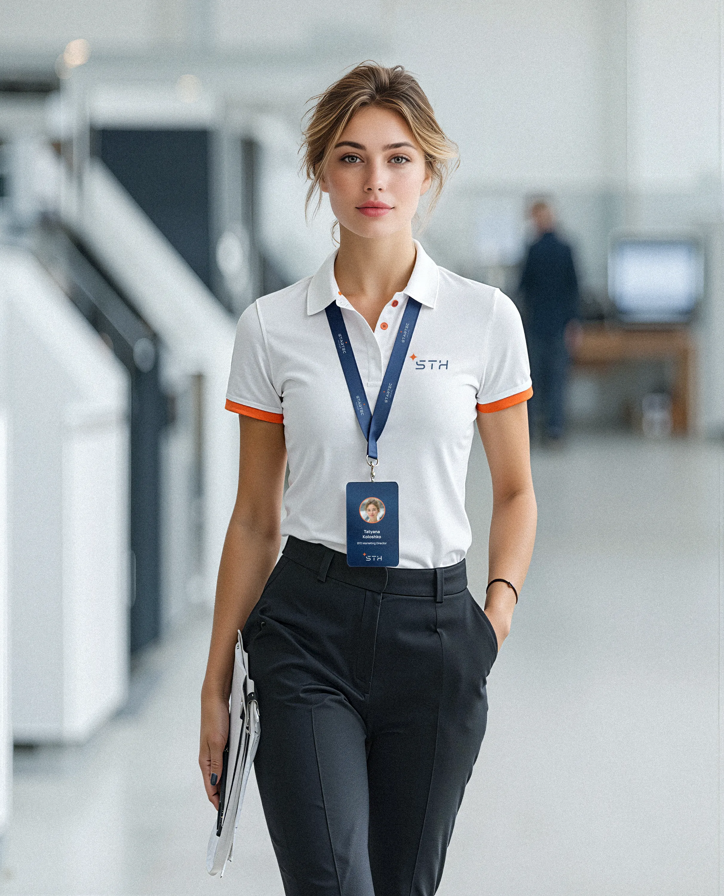
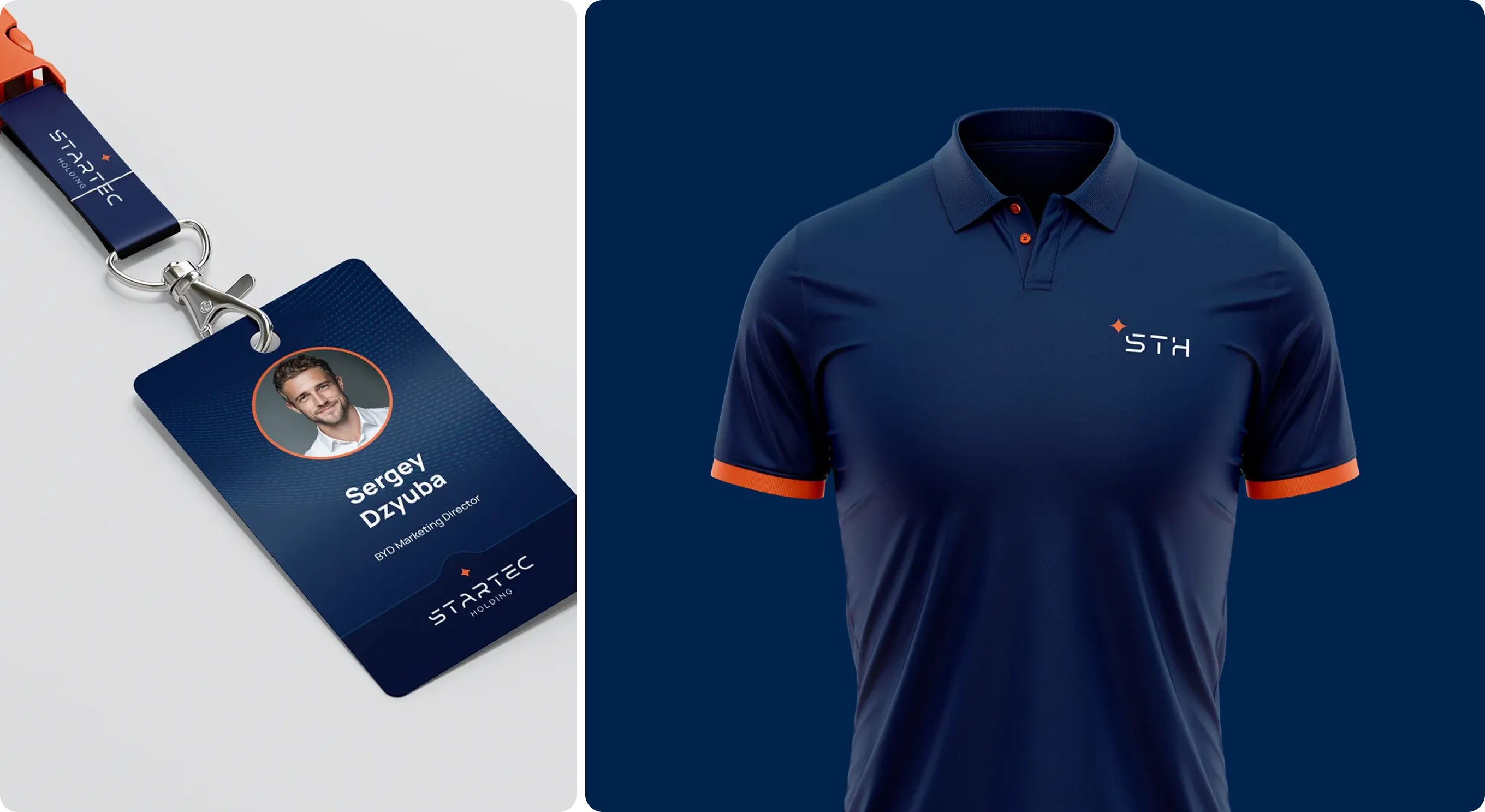
Office & Management: polos in light and dark colors. The minimalist STH logo and orange accents create the image of modern engineering management.
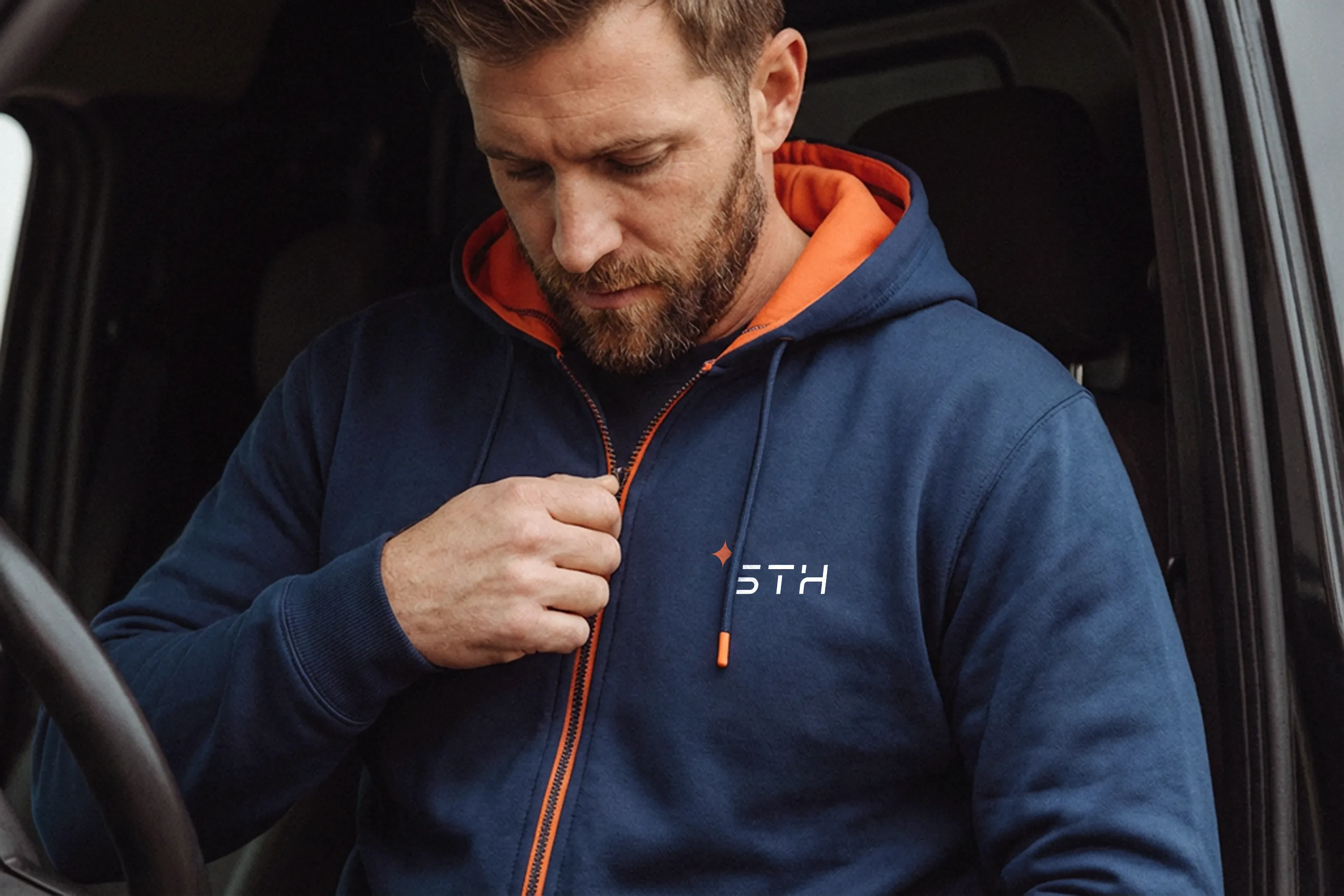
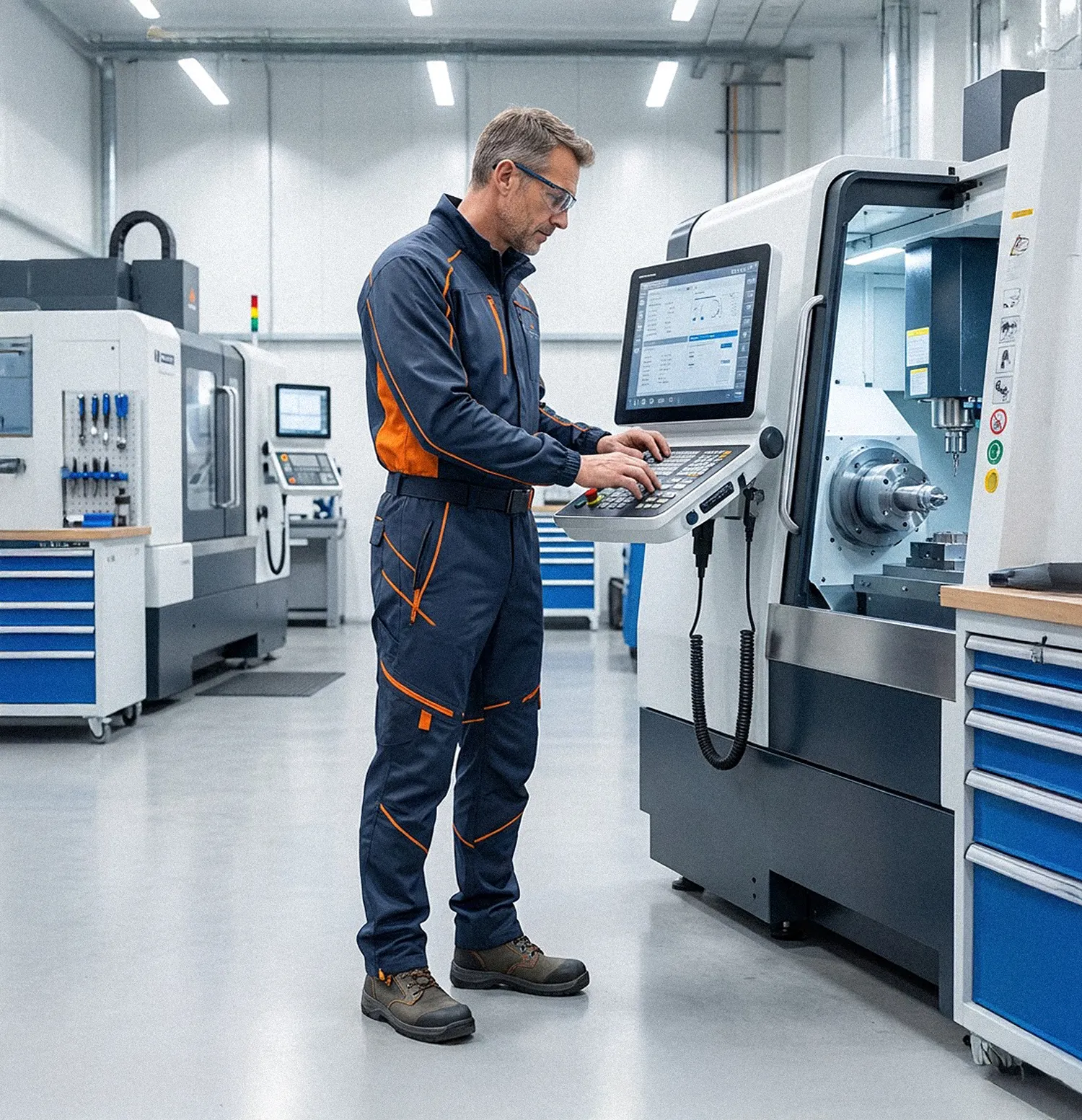
Service & Engineering: functional overalls and vests with reflective elements and contrast zoning. Plus hoodies, bomber jackets, and caps for fieldwork.

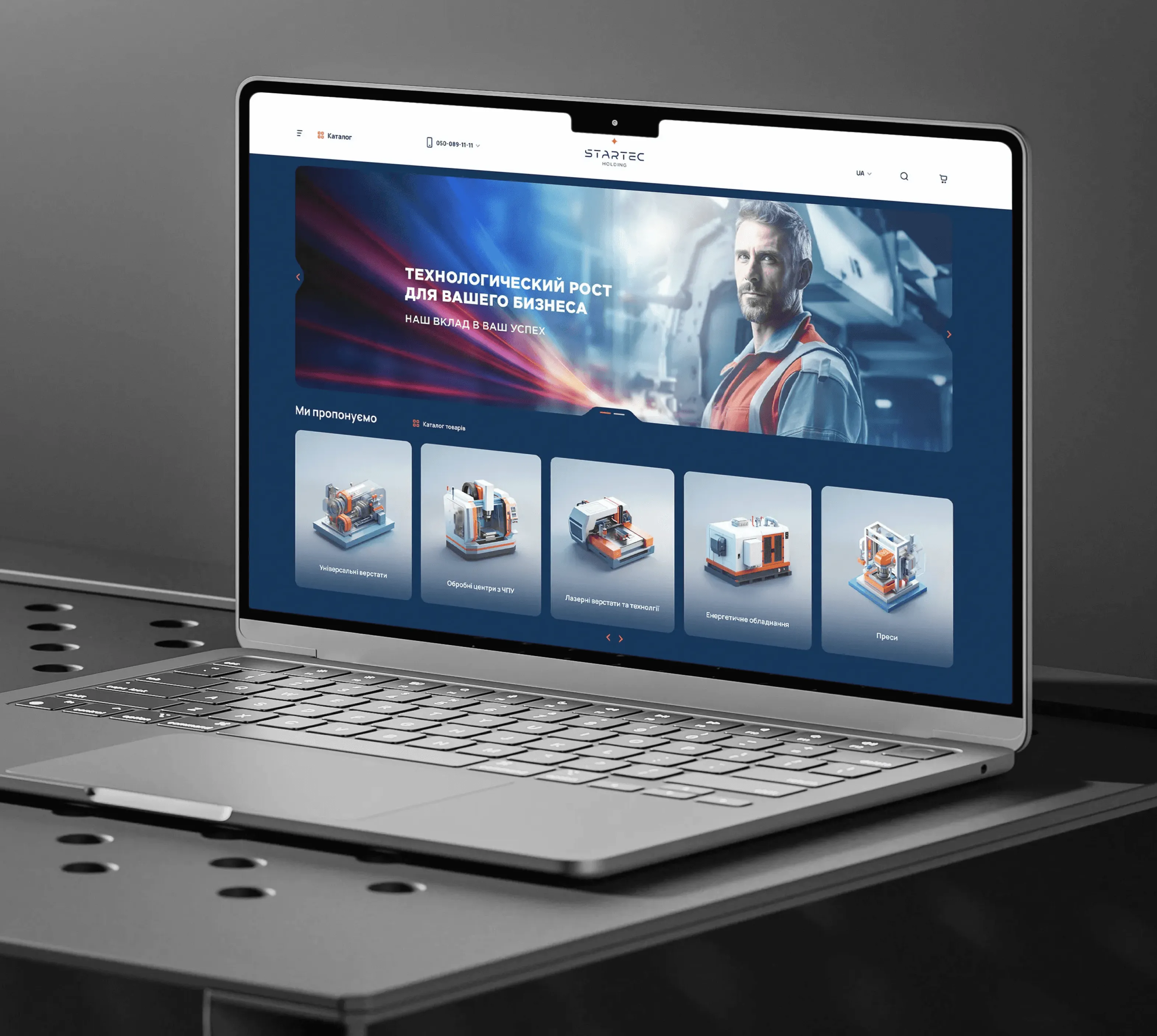
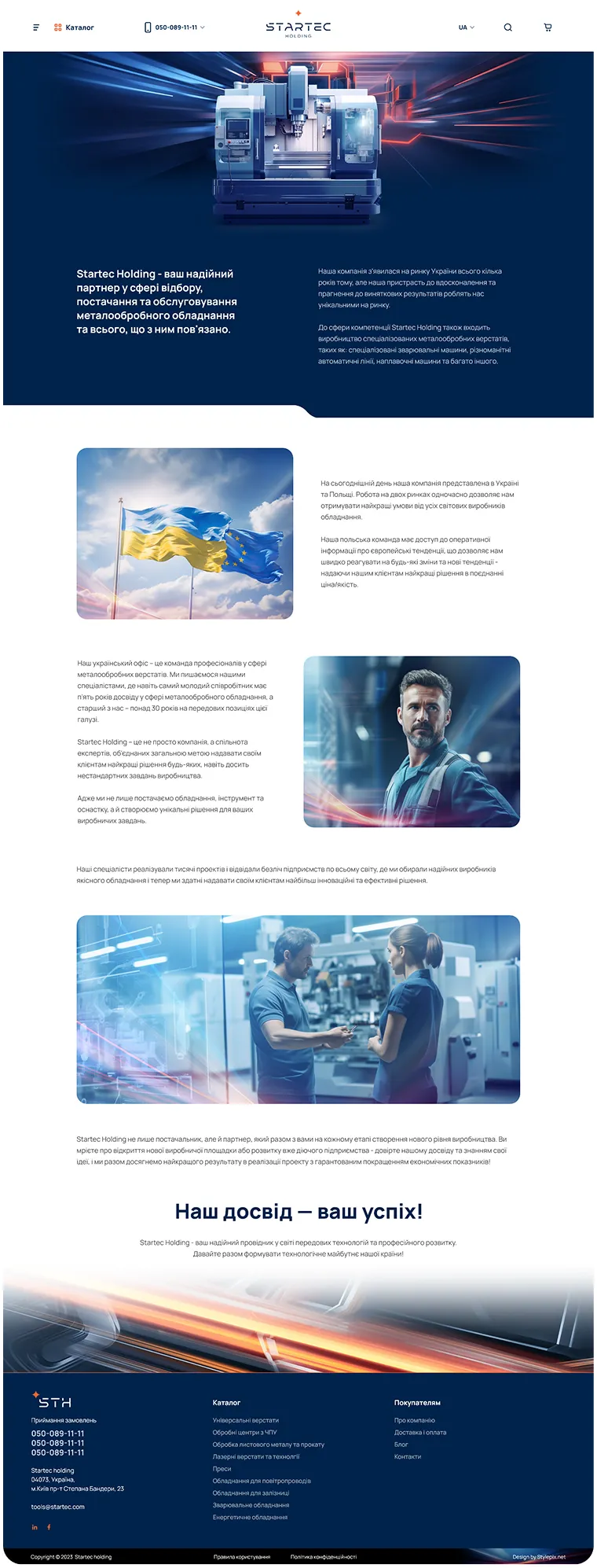
Startec Holding website
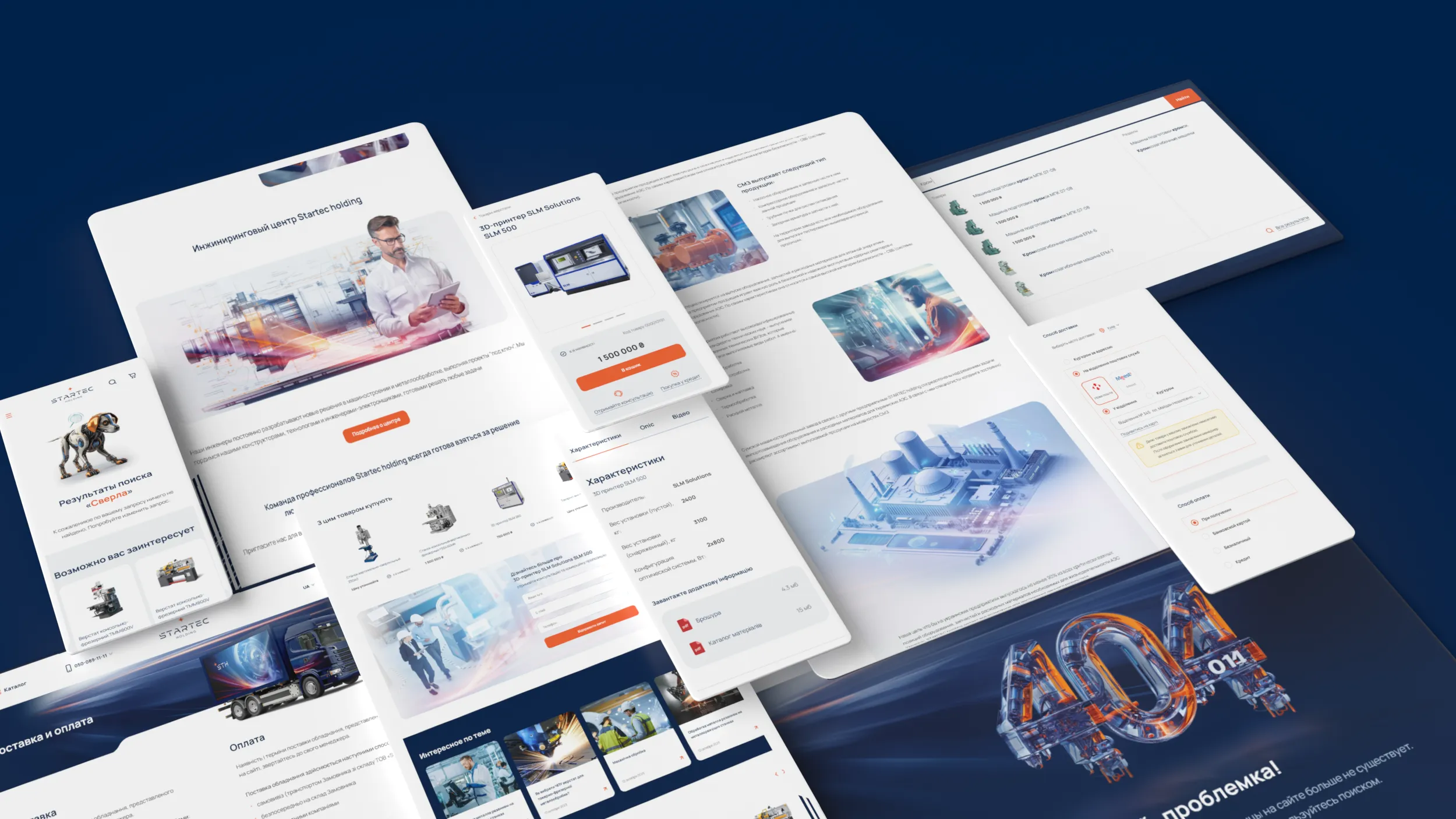
The multi-level website includes:
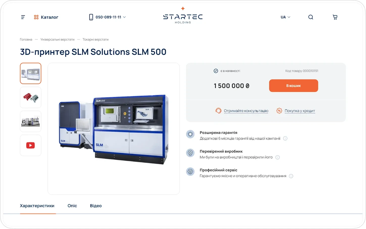
information about the company and production capacity
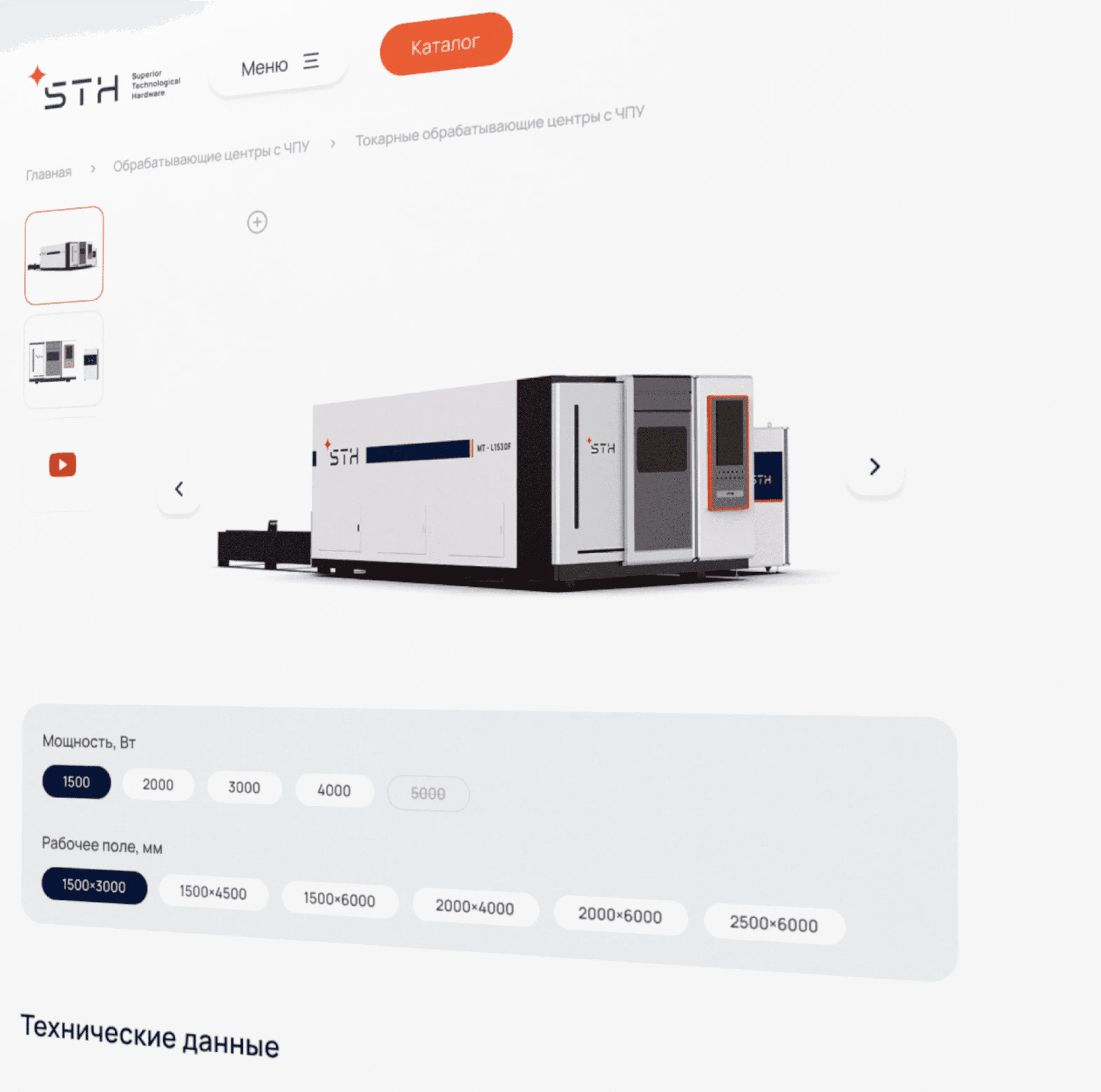
equipment catalog with filtering
product cards with technical specifications
the ability to submit a quote request
the ability to purchase small equipment and accessories
The site combines corporate presentation with e-commerce functionality.
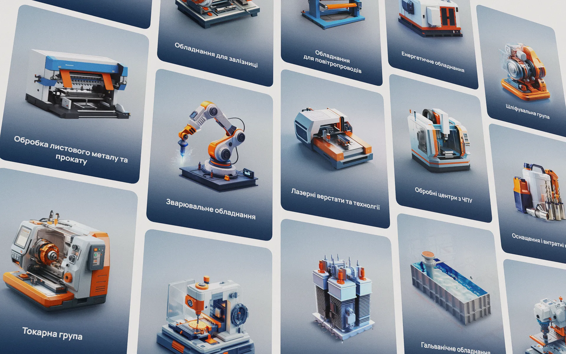
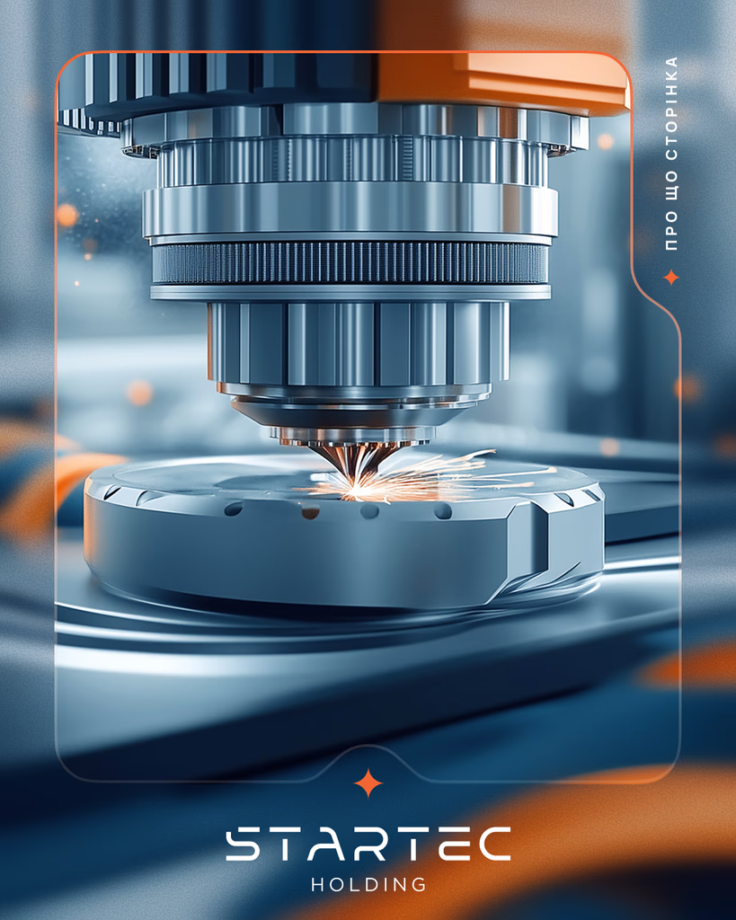
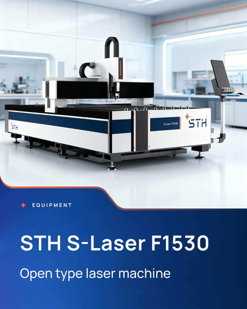
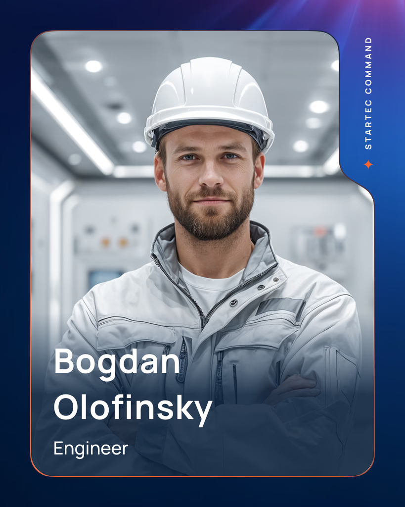
The visual system for social media covers templates for posts, equipment announcements, case studies, team, and company news. The visual presentation maintains industrial restraint and the brand's color dynamics.

A separate STH corporate catalog website
STH looks more streamlined and compact, while maintaining a visual connection to the parent brand.

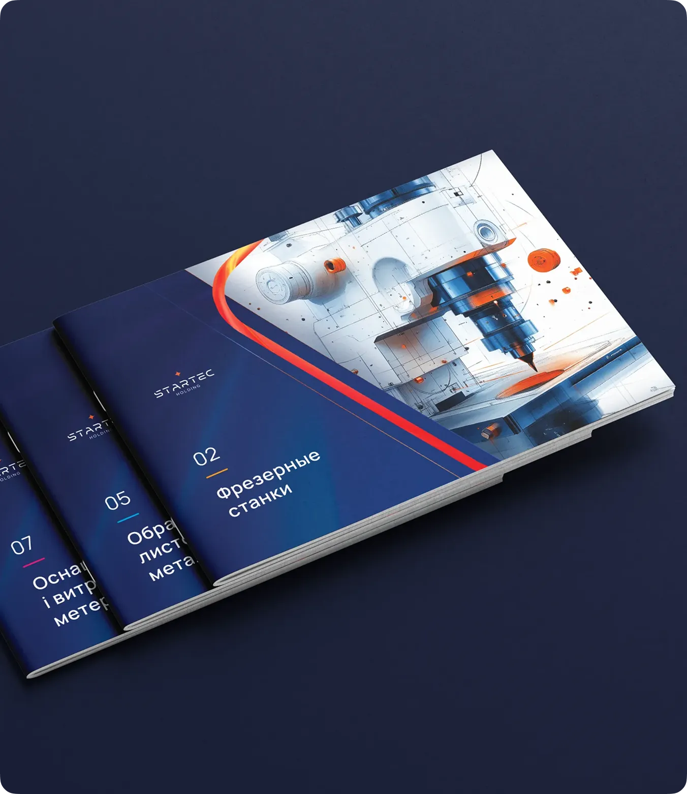
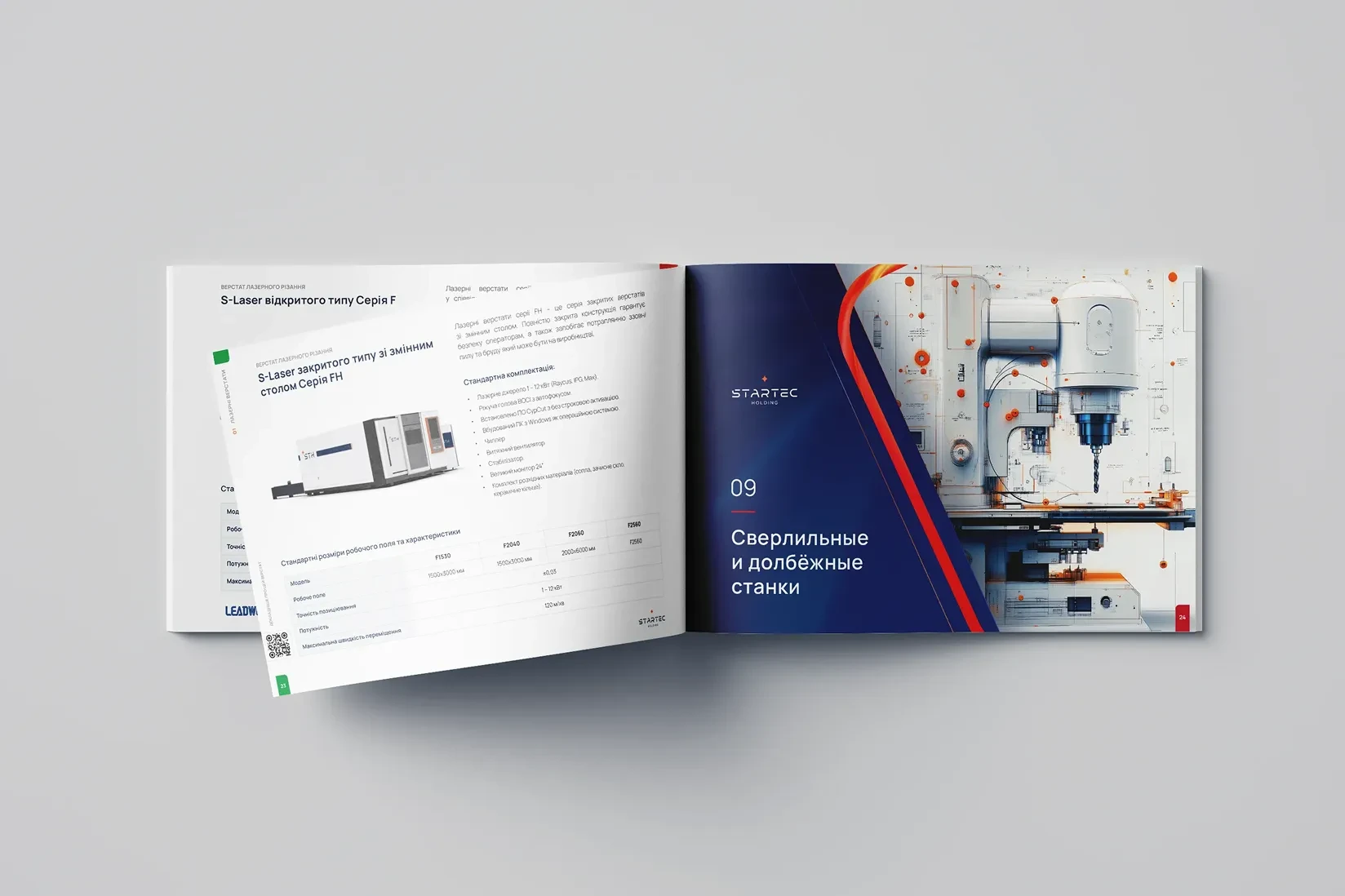
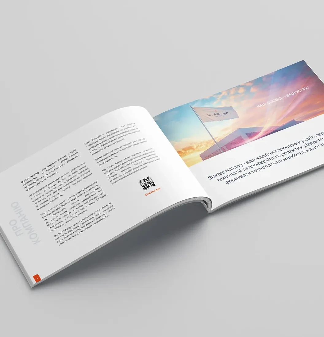
Product catalog design
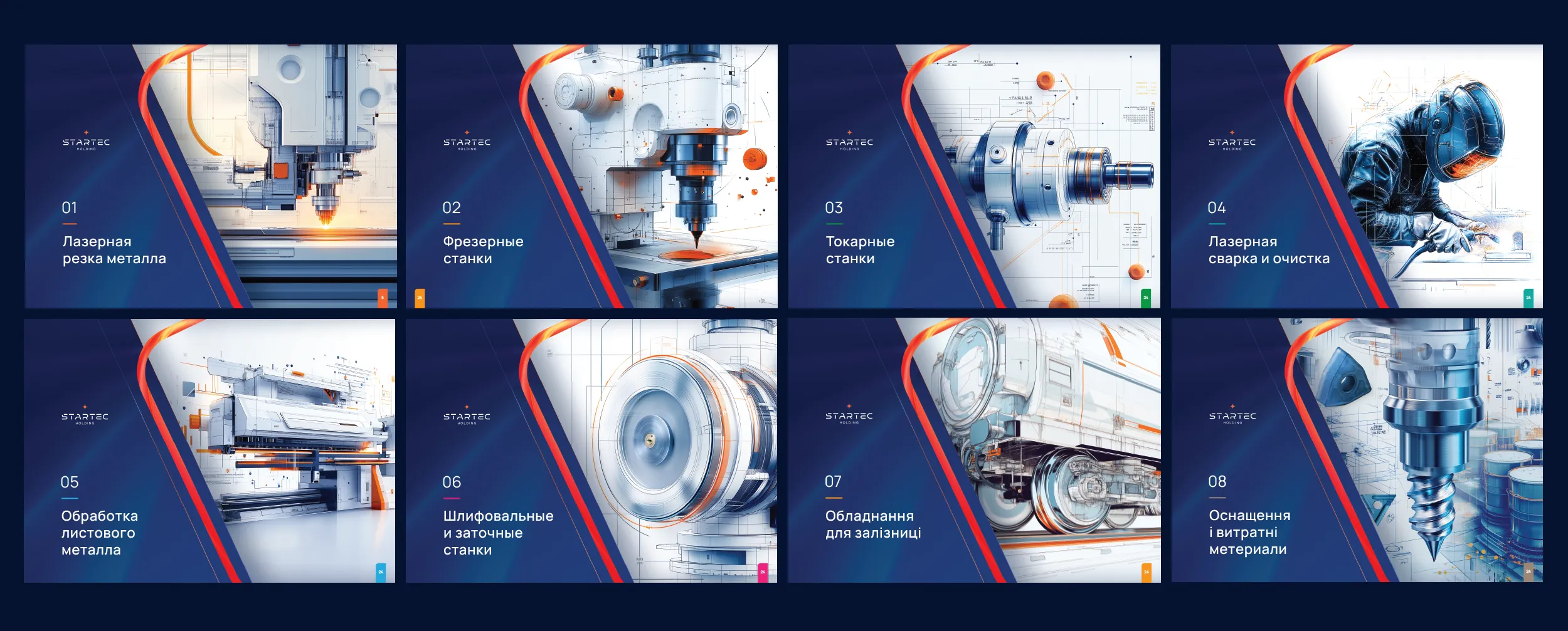
Each section (CNC centers, lasers, flexible presses) received its own color code and individual cover.
The design allows printing separate brochures by category, as well as compiling them into a single large volume. This optimizes printing costs and simplifies navigation for the client.
Results of the collaboration
The project formed a complete brand ecosystem:
a strong industrial identity
a unified system of corporate materials
a well-thought-out line of workwear and office attire
a flexible product catalog system
two corporate websites (main brand and sub-brand)
a unified visual system for digital communications
The project allowed the company to form a cohesive professional image, increase brand recognition, and prepare a visual foundation for scaling into the European market.


